Overview Goals Approach Scope Foundations Visual Design Outcomes
Case Study  ·  Design Systems  ·  Multi-brand

SRMG Design System

Unifying 25+ publications behind a single atomic design system — so every title ships faster, feels consistent, and speaks both English and Arabic.

Lead DesignerDesign SystemsAtomic DesignRTL / ArabicGovernance
Role

Lead Designer

Team

Solo

Duration

Long-term · ongoing

Scope

25+ publications

Design system — foundations & component library
Image placeholder

01 Overview & Problem

Twenty-five titles, twenty-five ways of building the same page.

Picture the group design team. Every publication — lifestyle, news, business, sport — was designed from scratch. Different designers drew divergent wireframes for the same article card, the same nav, the same newsletter block. The same component lived in a dozen near-identical, incompatible variants, and no two titles quite felt like part of the same house.

Underneath sat three structural failures: no single source — colours and type were re-keyed by hand per title and drifted instantly; RTL as an afterthought — Arabic was always retrofitted last, and always broke; and no governance — with no owner, a fix in one title never made it back to the rest.

This was the reality across SRMG's 25+ publications. The brief: replace the sprawl with one streamlined, multi-brand design system every title could build on. Its real user wasn't a reader — it was the next designer, who should assemble a title from a trusted library rather than redraw it.

0+
Publications maintained by hand
0
Designers drawing the same components differently
0wks
To wireframe a new title
0
Publication families to unify
02 Goals & Success Metrics

What “one system” had to deliver — agreed before a single component was drawn.

We translated the ambition into three measurable goals, using the group's own delivery KPIs as the yardstick so success wasn't a matter of taste.

01

Ship new titles in days, not weeks

Target — new-title wireframes 3 weeks → under 1 week
02

One consistent language across every brand

Target — 90%+ of screens built from shared components
03

Native English & Arabic from day one

Target — every component ships an EN + RTL variant

03 Approach

From twenty-five fragmented titles to one atomic library.

Rather than design a system in the abstract, I worked bottom-up from the titles themselves — grouping them into families, distilling the patterns they genuinely shared, then building those up into a governed atomic library.

Step 01

Audit every publication

Catalogued how each of the 25+ titles was built and where the same patterns had quietly diverged.

Step 02

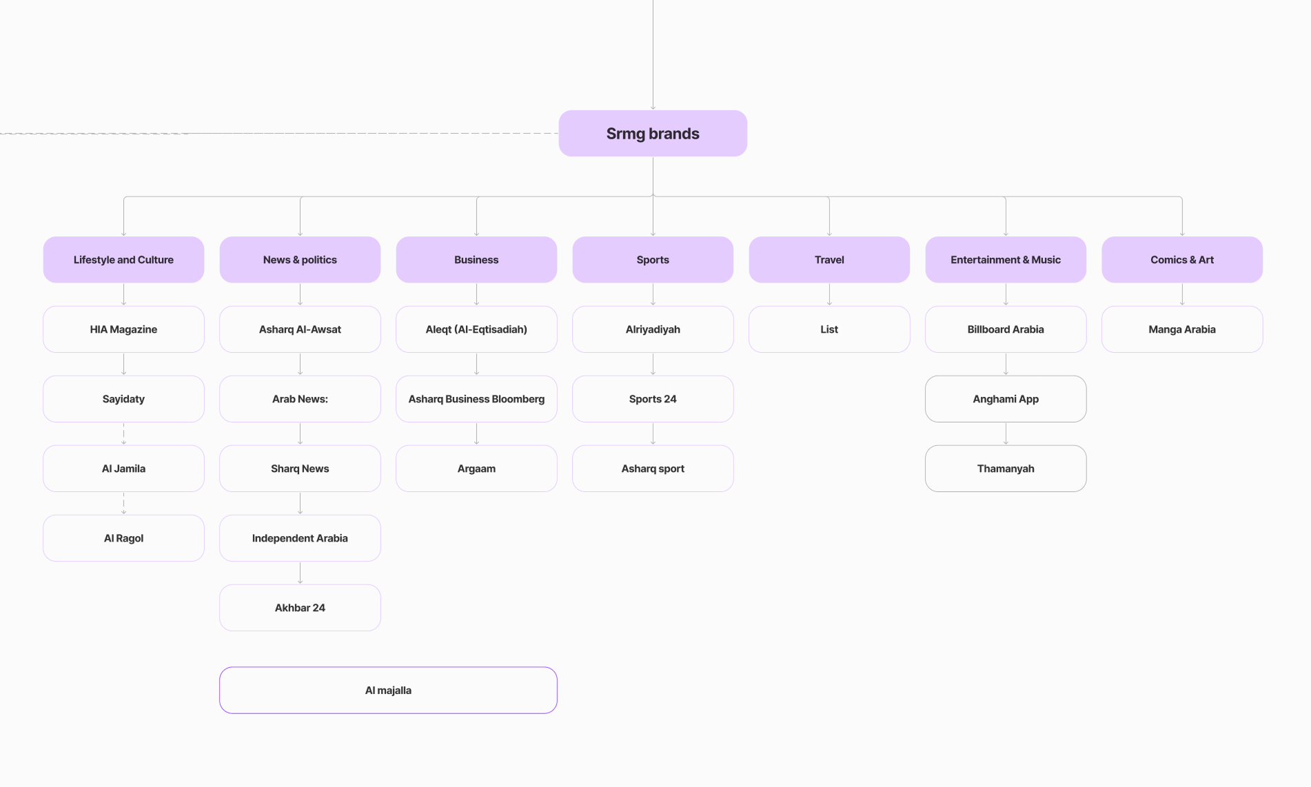
Bucket into categories

Grouped titles into families — Lifestyle, News, Business, Sport, Travel, Entertainment, Comics — to see what they truly shared.

Step 03

Find the common components

Pulled the repeated patterns out of every family and reduced them to a single canonical set.

Step 04

Build the atomic library

Assembled foundations, atoms, molecules and organisms into one governed, themeable system.

04 Component Prioritisation

A sprawling component wishlist, prioritised into a confident v1.

I mapped every candidate component onto a value vs. effort matrix, so the first release covered what every title needed most — not simply what was quickest to draw.

Effort → Value → Highest priority Yes Why not Later Colour styles Type styles Buttons & Inputs Tags Article Card Global Nav Hero Banner Article Header Toggles Steppers Pagination Newsletter block Comics reader
Outcome of prioritisation Phase 1 shipped: Foundations (type, colour, grids, iconography), the core atoms — buttons, inputs, dropdowns, tags — and the two highest-traffic organisms, Article Card and Global Nav. Deferred: the Comics reader and Newsletter block — real value, but only a handful of titles needed them at launch.

05 Architecture & Foundations

Foundations, to atoms, to molecules, to organisms.

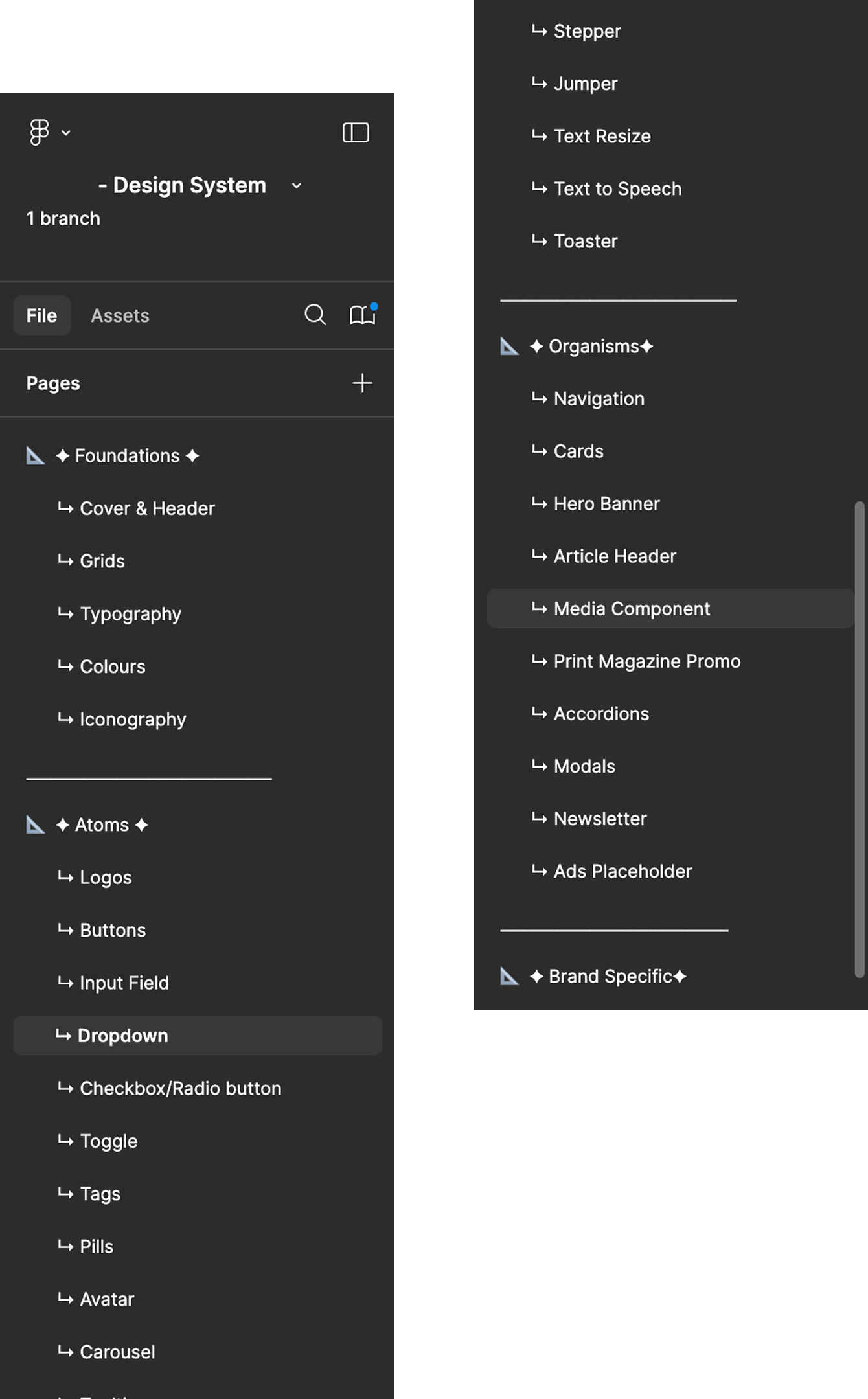
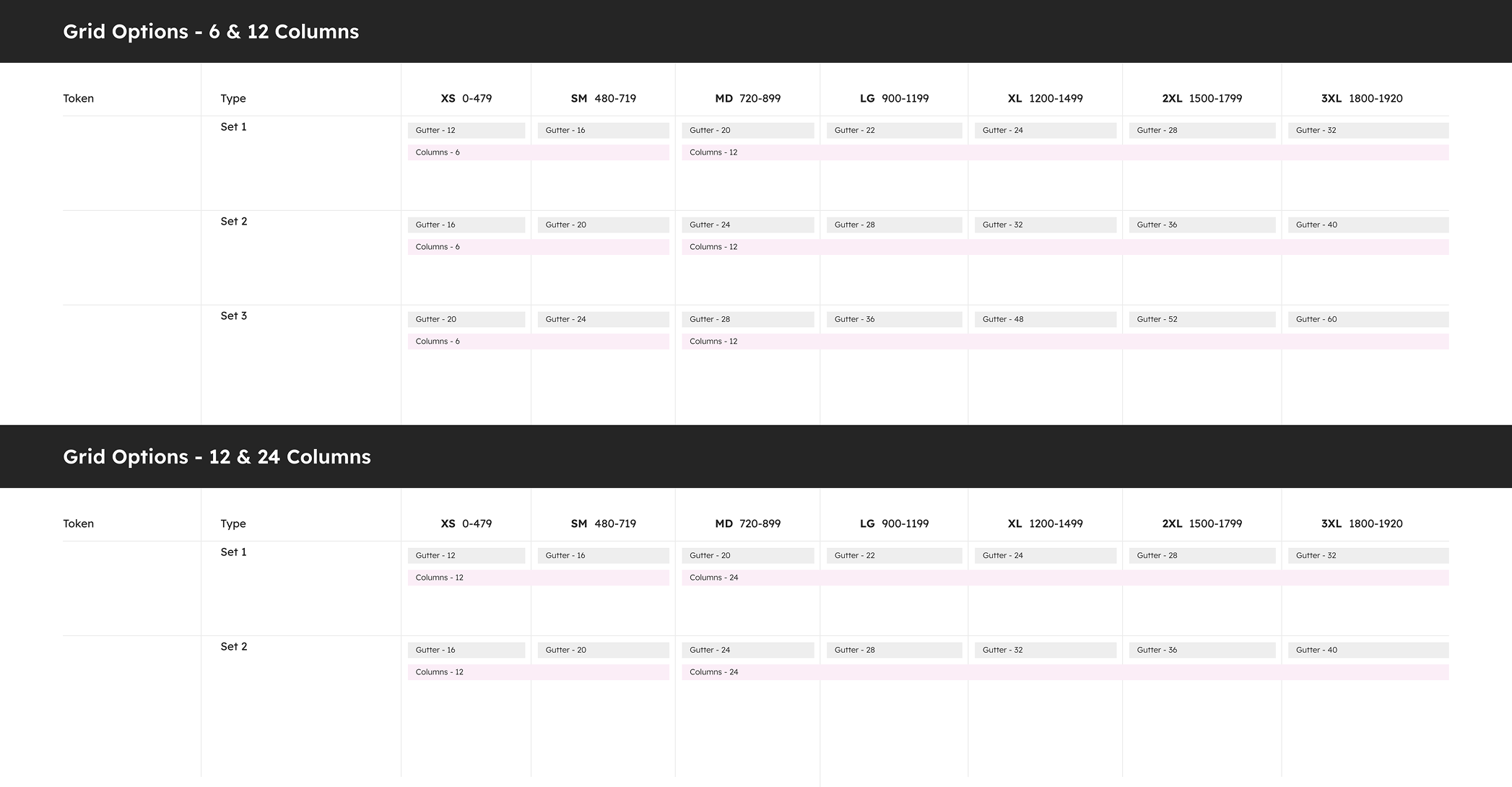
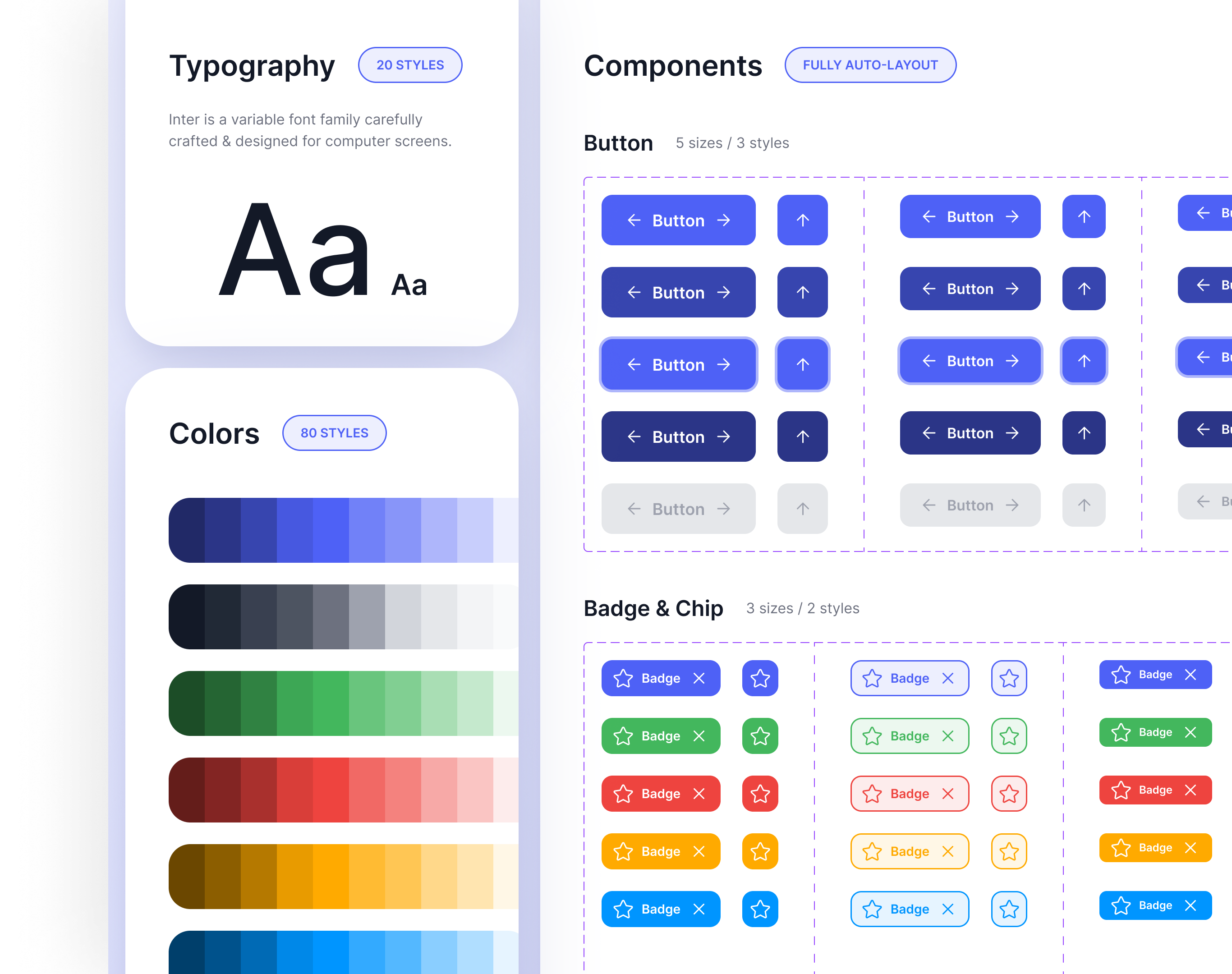
The library is organised as an atomic hierarchy — every organism traces back to the same foundations, so a change to one colour or type style ripples everywhere, once. Foundations carry the Inter variable font, ~20 type styles, 80 colour styles, one unified icon set, and responsive 6/12/24-column grids across every breakpoint — with each component shipping an EN and an Arabic/RTL variant from a single master.

Atomic hierarchy — foundations → organisms
Placeholder
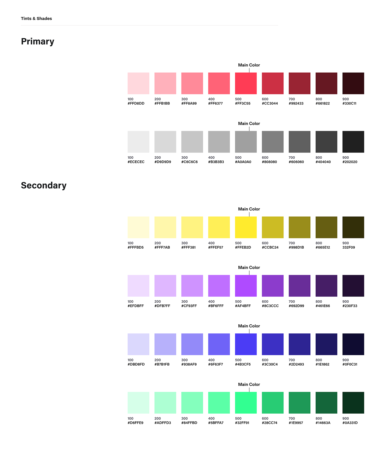
Colour foundation — 80 styles
Placeholder
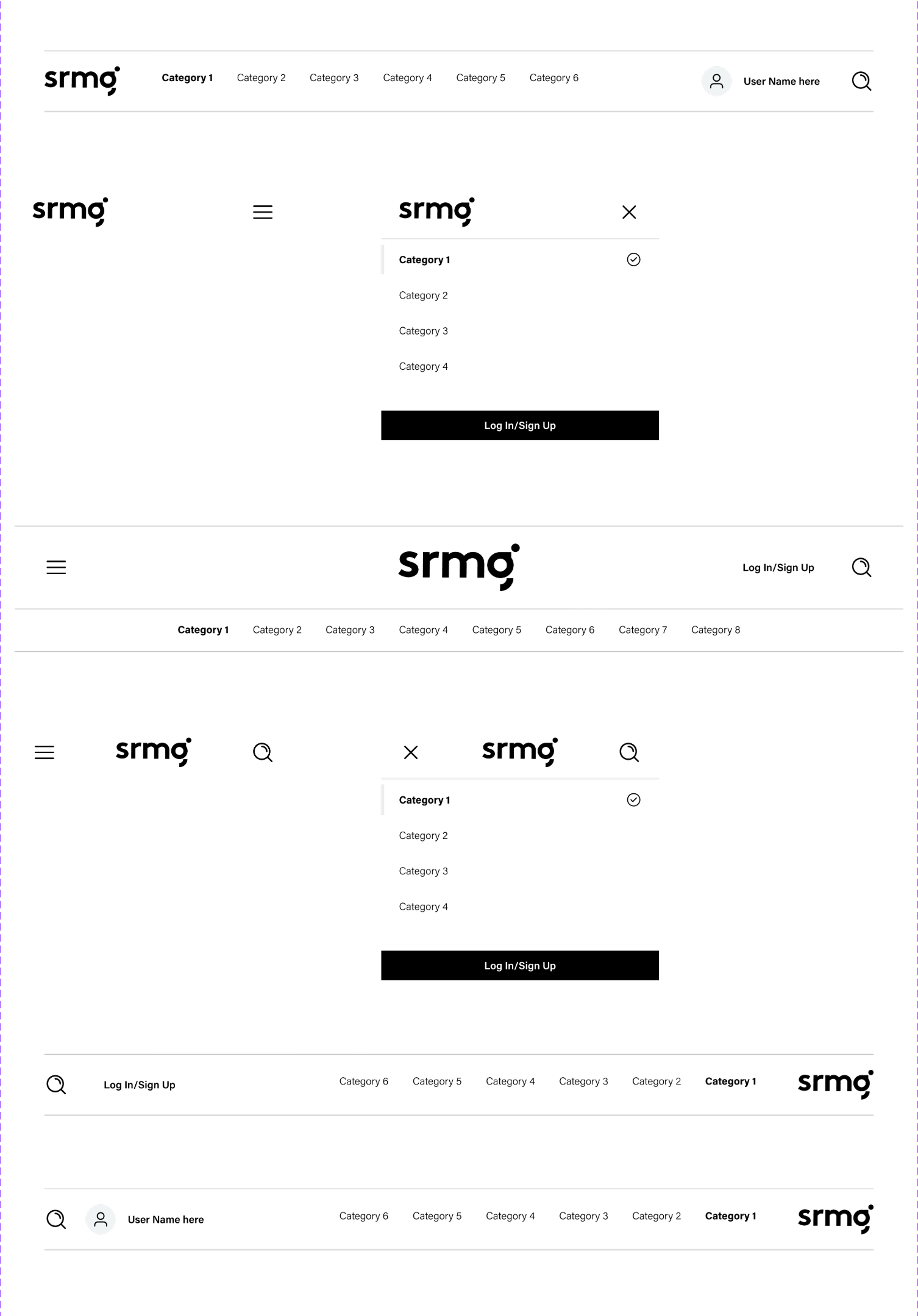
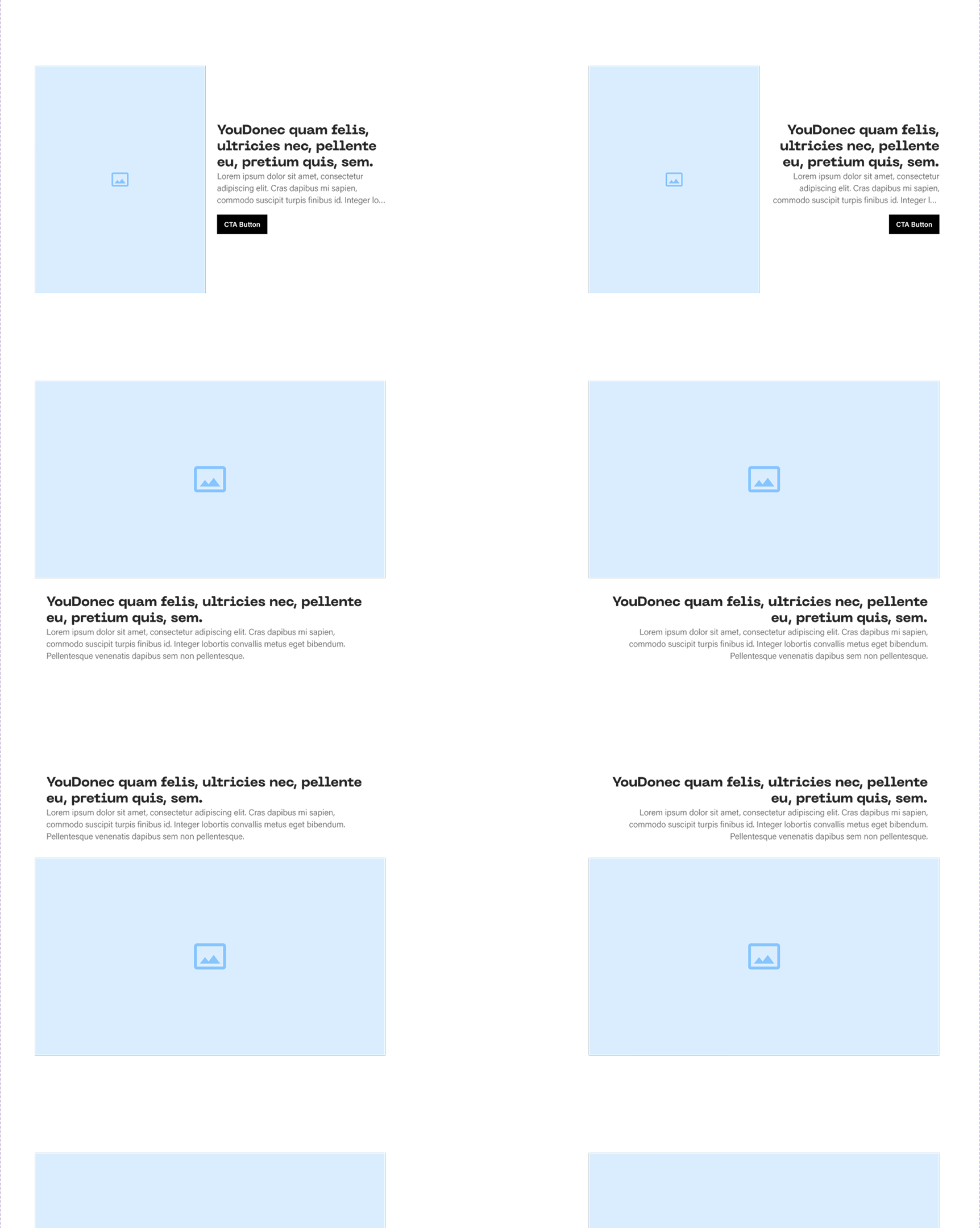
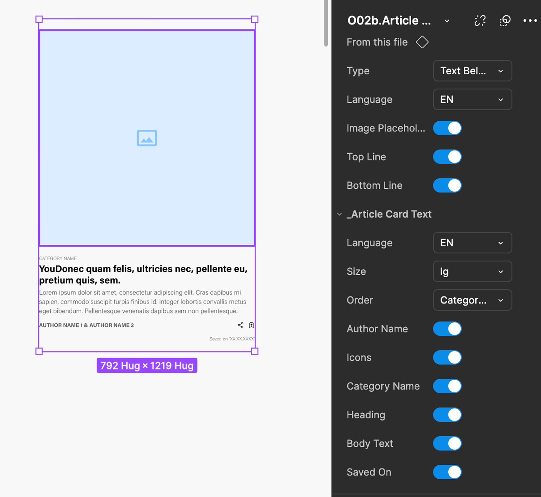
Component anatomy — “002b Article Card”, variants & nested atoms
Placeholder

06 Visual Design

One system, rendered — foundations you can see and components you can trust.

The library ships as a governed set of foundations and components, each with toggleable variations and nested atoms, so a designer assembles a title rather than redrawing it.

System overview — foundations & components
Placeholder
Colour — 80 styles, tints & shades 100–900
Placeholder
Type scale — ~20 styles on Inter variable
Placeholder
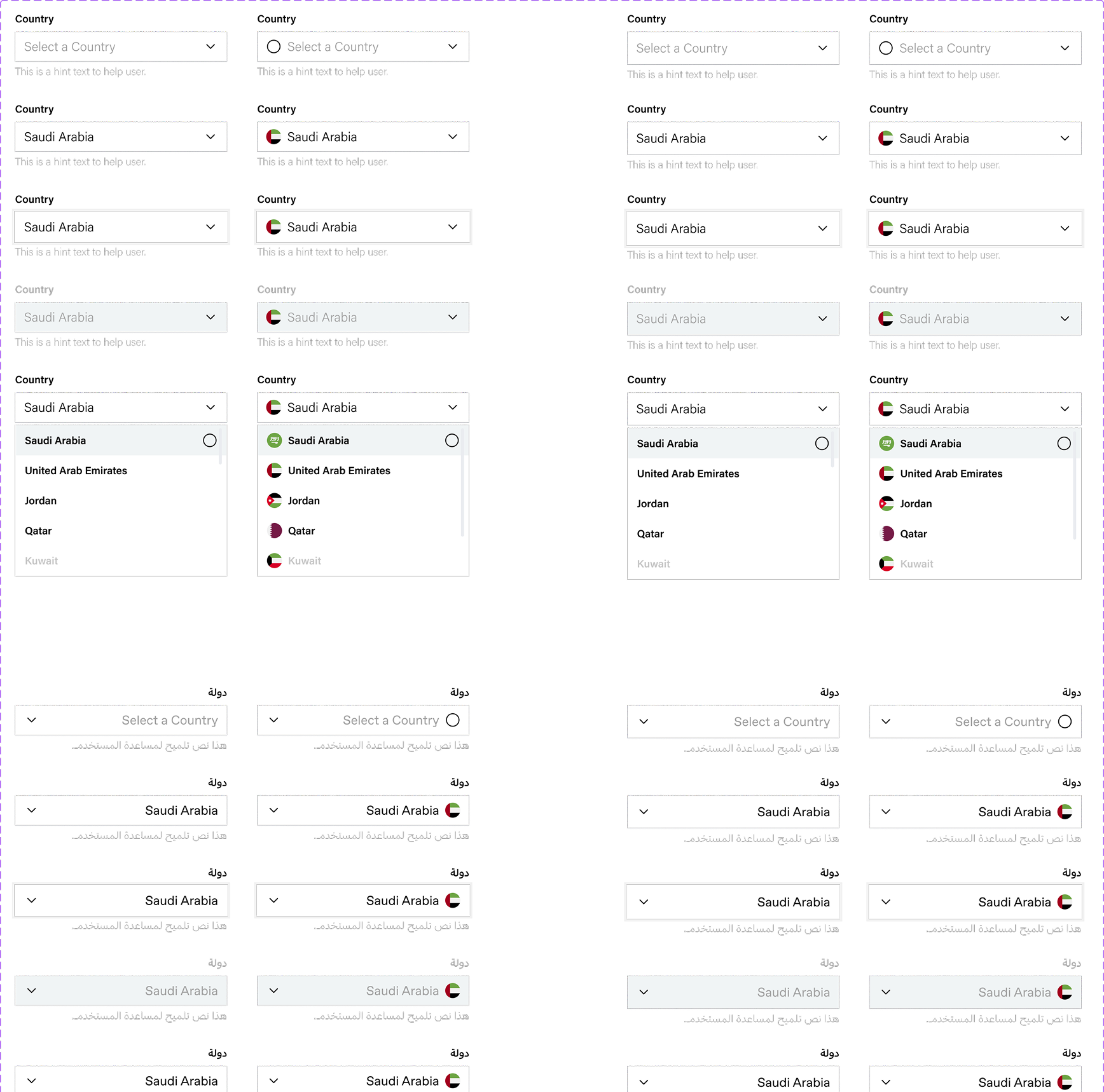
Atoms — buttons, inputs, dropdowns, tags
Placeholder
Article Card — EN & Arabic / RTL variants
Placeholder

07 Outcomes & Impact

Adopted across the group — and the titles started to feel like a family.

The system rolled out to the design team and became the default starting point for new work. Early results tracked directly against the three goals we set at the start.

0wk
To wireframe a new title
down from 3 weeks
0%
Of new screens from shared components
consistency by default
0+
Components reused across brands
atoms → organisms
0+
Publications on one system
EN + Arabic

“For the first time our titles feel like they belong to the same company — and a new launch starts from a library, not a blank canvas.”

— Head of Product Design, SRMG
If I ran it back

I'd ship governance alongside the very first components, not after — a system only stays consistent if there's a clear owner and a contribution path from day one.

Next project
Oxagon Digital Twin