Overview Goals Personas Approach The Platform Design System Data & Simulation Outcomes
Case Study  ·  Digital Twin Platform  ·  Product & Design System

Oxagon Digital Twin

A web platform to explore, simulate and manage a city that doesn't exist yet — turning NEOM's Oxagon masterplan into a living, queryable digital twin.

Senior Product DesignerProduct UXDesign SystemGIS / 3DData Visualisation
Role

Senior Product Designer

Team

Design + GIS + Engineering squad

Duration

~12 months

Scope

End-to-end web platform

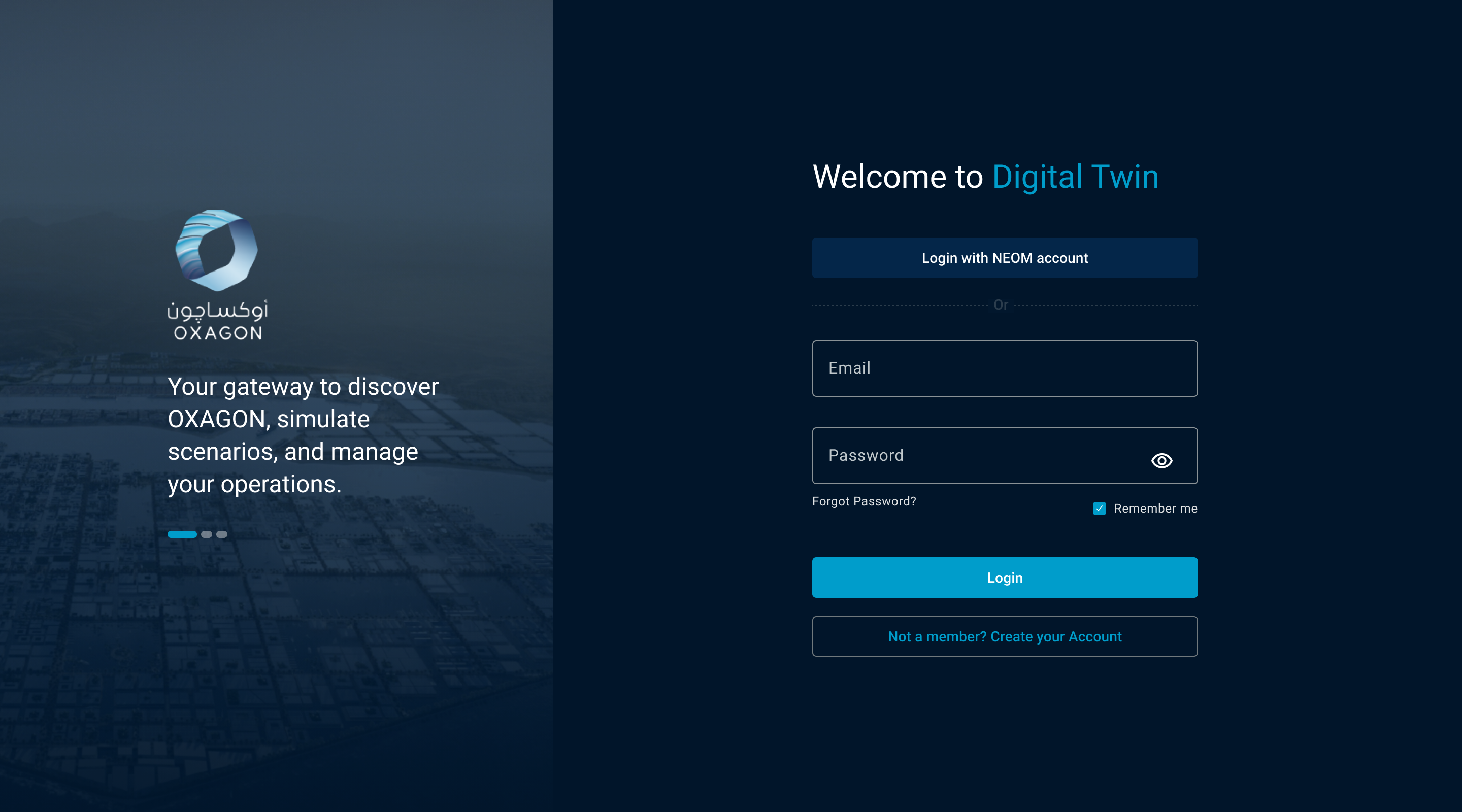
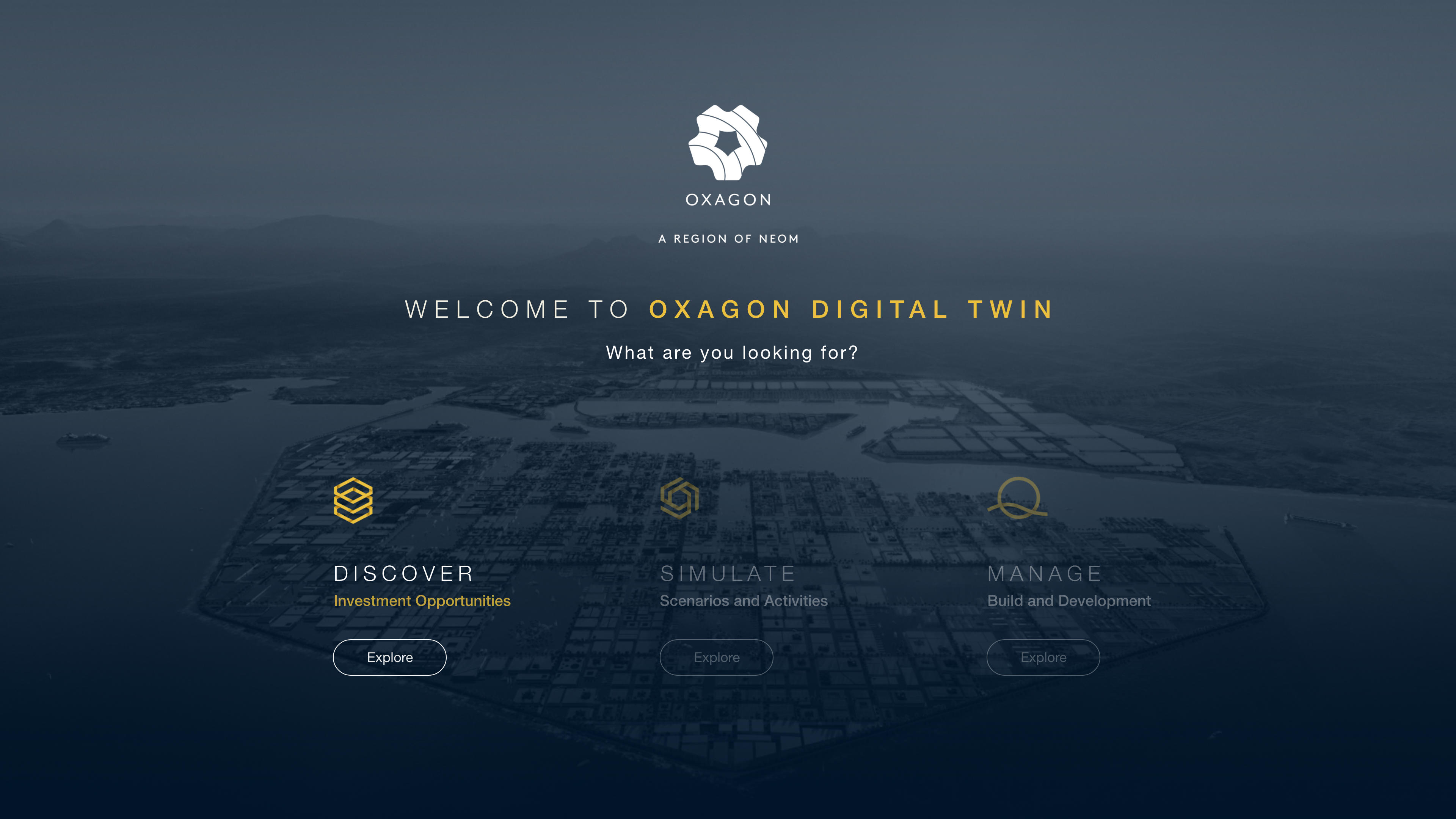
Oxagon Digital Twin welcome screen — Discover, Simulate, Manage
Welcome — three ways into the twin: Discover, Simulate, Manage.01 / 09

01 Overview & Problem

How do you design for a city that's still just a masterplan?

Oxagon is NEOM's industrial city region — a place being planned and built from zero on the Red Sea coast. Long before a single foundation was poured, the people shaping it — investors, urban planners, leadership — needed to see the plan, question it, and stress-test it. The data to do that already existed: GIS layers, 3D BIM models, population and development forecasts. It just lived in specialist engineering tools that no decision-maker could open.

Three structural gaps made the masterplan hard to reason about: fragmented data — GIS, building models and socio-economic forecasts each sat in their own expert software; no shared canvas — every stakeholder saw a different slice, never the whole; and static outputs — a printed masterplan can describe a city, but it can't answer "what if we densify this district?"

The brief: one web platform — the Oxagon Digital Twin — where anyone from an investor to a planner could Discover opportunities, Simulate scenarios and Manage the build, all on a single interactive model of the region. Its real user wasn't a GIS analyst; it was the decision-maker who should interrogate the city, not decode a file.

0
Core modes — Discover · Simulate · Manage
0
Interest layers to unify
0
Assets modelled in the twin
0
Data domains unified on one canvas
02 Goals & Success Metrics

What the twin had to deliver — for people who'd never open a GIS tool.

We translated the ambition into three measurable goals, agreed with stakeholders before any interface was drawn, so success wasn't a matter of taste.

01

Make expert data legible to non-experts

Target — a first-time user runs a meaningful query in under 2 minutes
02

Turn a static masterplan into a living model

Target — every layer explorable, measurable and simulatable
03

One twin, three audiences

Target — role-based views (investor · planner · operator) from a single source

03 Personas & Journey

Two people, one twin — the investor who spots the opportunity, and the planner who stress-tests it.

The platform serves several audiences, but two drove the core design. Neither wanted a GIS tool; both wanted answers. Mapping their needs and frustrations kept every decision anchored to a real question someone was trying to ask.

L

Layla

Investment Analyst · Discover

“Show me where the return is — before I open a single GIS file.”

Domain knowledge
GIS fluency
Time pressure
Needs
  • Spot high-potential zones in minutes, not weeks
  • Compare catchment, land-use and developable area side by side
  • Numbers she can trust and take into a board meeting
Frustrations
  • The data she needs is locked inside expert software
  • Static reports can't answer “what if we densify this?”
  • No way to weigh two districts against each other quickly
M

Marco

Urban Planner · Simulate

“I need to stress-test density while it's still a decision — not once it's concrete.”

GIS fluency
Data-trust need
Stakeholder load
Needs
  • Toggle land-use, mobility and utility layers on one canvas
  • Simulate density and footprint, then read the impact instantly
  • Measure routes and catchment directly on the model
Frustrations
  • Constantly switching between siloed engineering tools
  • Re-keying the same data to answer a new question
  • No shared canvas to align non-technical stakeholders

Marco's journey is where the twin earns its keep — a single end-to-end path from a hunch to a decision he can defend. Mapping it exposed exactly where the experience had to hold his confidence.

Customer journey — Urban Planner, “stress-test a density scenario”emotion tracked below
Stage
01

Frame

02

Explore

03

Simulate

04

Analyse

05

Decide & share

Doing

Asks “what if we densify the port district?” and opens the project.

Toggles land-use & mobility interest layers, reads the twin.

Adjusts density inputs and runs the development scenario.

Reads updated footprint, GFA and typology dashboards.

Exports the view and shares it with stakeholders.

Touchpoints
ProjectsArea selection
InterestsBase map
SimulateInputs
Dev. IntensityCharts
ExportSave & share
Mindset

“Is this even the right area to push?”

“Good — the twin matches what I know on the ground.”

“So much to set… am I sure these inputs are right?”

“There it is — density costs me open space here.”

“Now I can defend this in the room.”

Feeling
Curious Confident Uncertain Reassured In control
Opportunity

Start every project from the question, not a blank map.

Make layers legible enough to build trust fast.

Guide & validate inputs so simulation never feels like guesswork.

Update every chart live from one model — no disagreements.

One-click, on-brand exports built for the boardroom.

The dip at Simulate is the design's pressure point — the moment the product had to guide, validate and reassure, or lose him.

04 Approach

From siloed engineering data to a map-first workspace.

Rather than start from screens, I started from the questions each audience actually asks — then worked back to the smallest set of modes, layers and controls that could answer them on one canvas.

Step 01

Frame the three modes

Set Discover, Simulate and Manage as the spine of the product — one clear intent behind every door.

Step 02

Translate data into "interests"

Turned raw GIS & BIM into human-readable interest layers — land-use, mobility, utilities, sustainability — anyone could toggle.

Step 03

Design the map-first workspace

Made the 3D twin the permanent canvas, with a light left HUD and floating analytics that never hide the city.

Step 04

Systematise everything

Built a dark-first design language so every panel, control and chart stayed consistent across a data-dense product.

05 The Platform

A map-first workspace: the twin is always the canvas, everything else is a light layer on top.

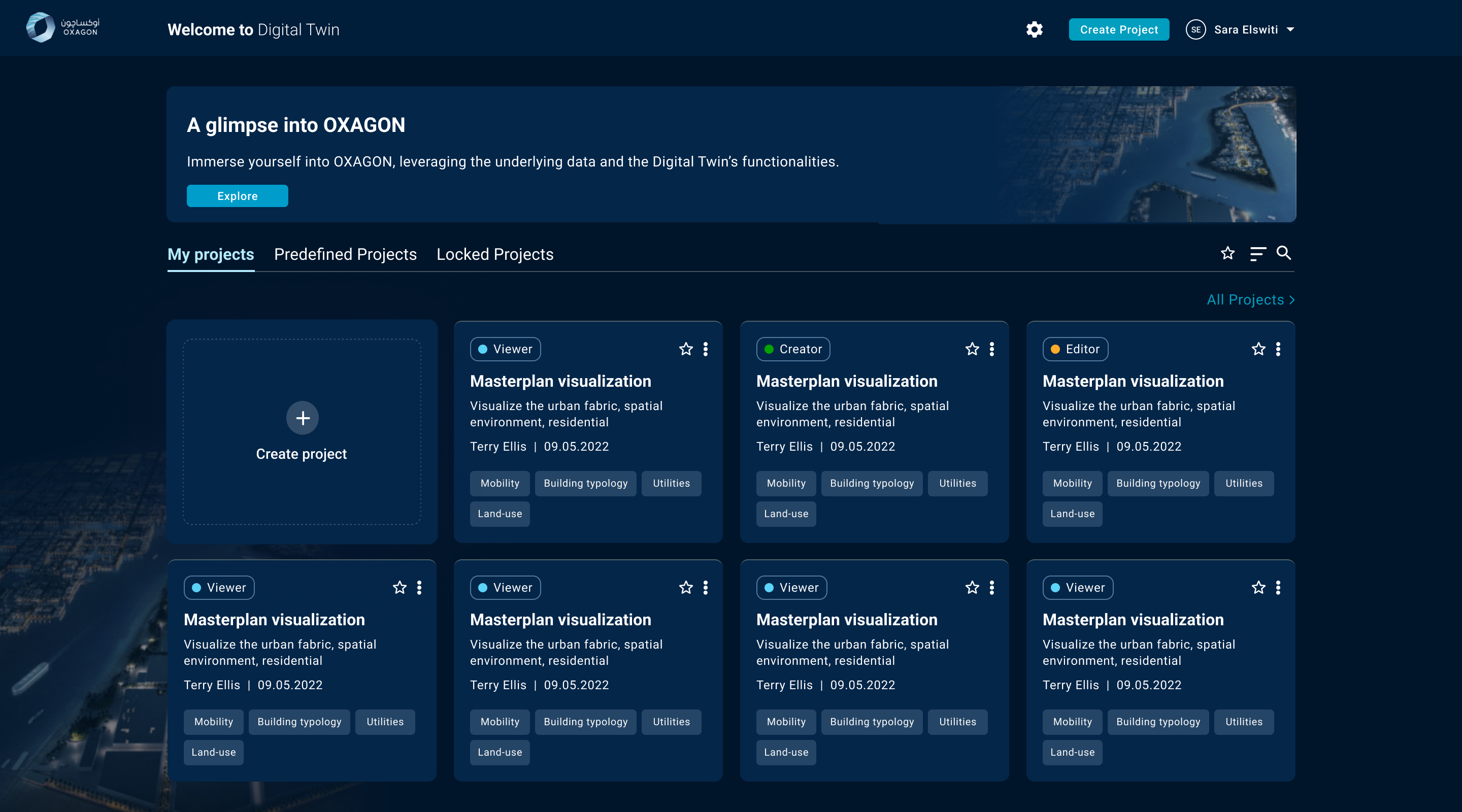
A user signs in, picks a project, and lands in the explorer. The 3D model of Oxagon fills the screen; a slim left HUD holds the four things you ever need — Area selection, Interests, Base map and Tools — while everything else stays out of the city's way until it's called for.

Projects dashboard with role-based access
Login — NEOM SSO or email
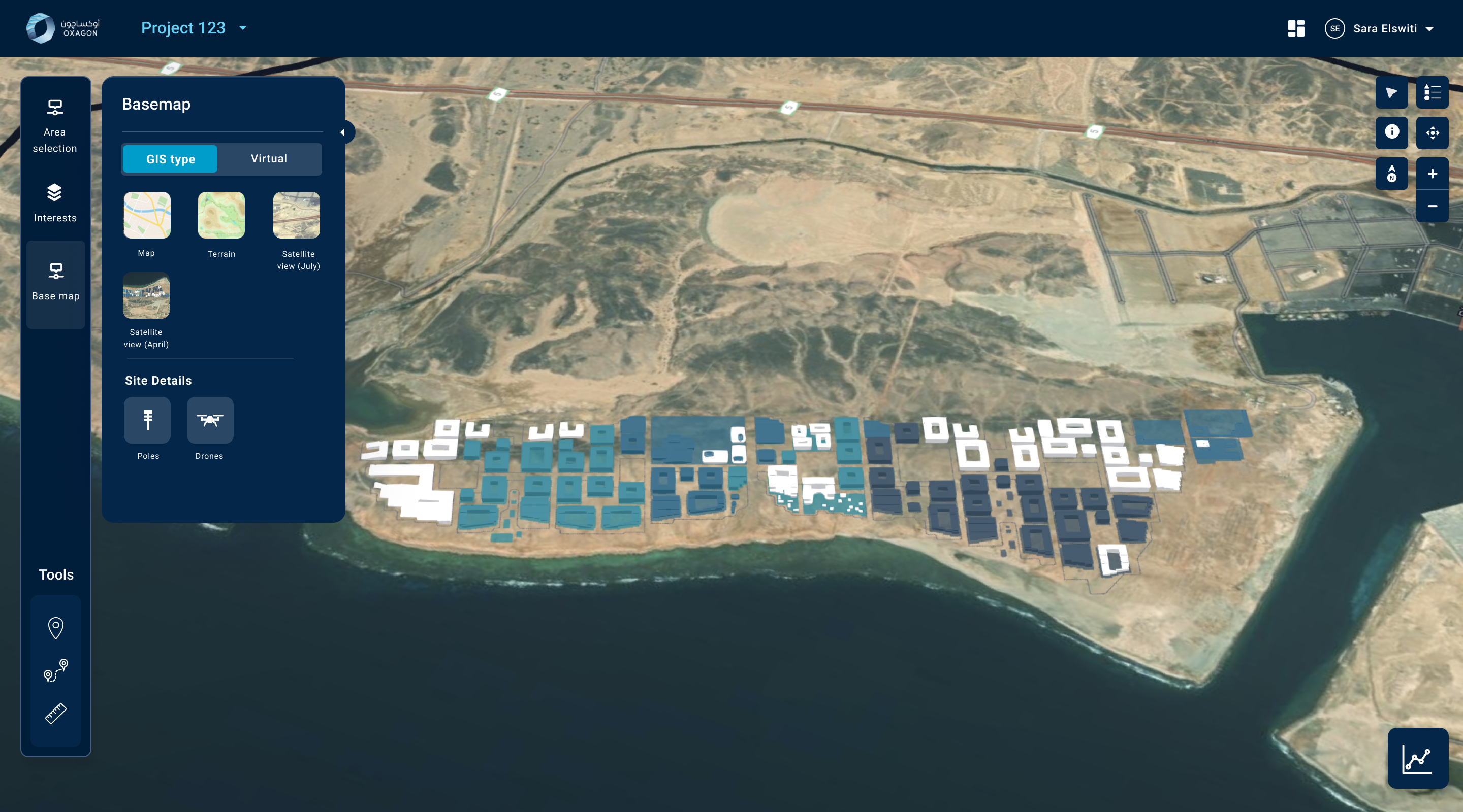
Explorer with base-map panel — GIS and virtual modes
Projects dashboard with Viewer / Creator / Editor roles · authentication · the explorer with its base-map switcher.02–04 / 09
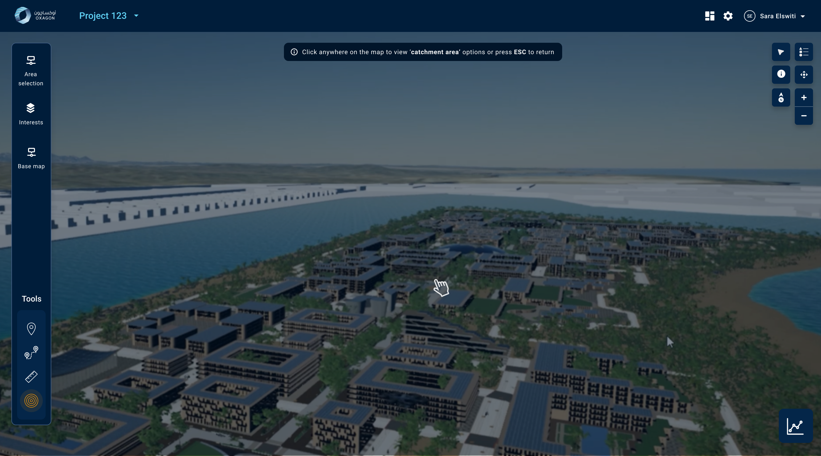
Key move — one canvas, two realities The same twin flips between a GIS base map (satellite, terrain, time-stamped captures) for grounded analysis and a photoreal Virtual 3D mode for walking the future city — so a planner and an investor can meet on exactly the same model.
Photoreal virtual 3D mode of Oxagon
Virtual 3D mode — the same twin, walkable, for catchment and experience questions.05 / 09

06 Design System & Foundations

Underneath the twin: a dark-first design language built for data density and sunlight.

A data product this dense drifts fast without a system. I authored a design language — the foundations, tokens and components every screen is assembled from — governed by five principles agreed up front.

01

Reliable

Accurate information and consistent experiences that always deliver.

02

Simple

No obstacles, straight to the point, focused on the target.

03

Contextual

The right experience, at the right time, for the task at hand.

04

Inclusive

Everyone can contribute, regardless of who they are.

05

Progressive

Adapts and scales to become anything the need requires.

Colour — brand & neutrals
Wave Blue
#009CBD · primary
Slate
#37424A
Stone
#818A8F
Ceramic
#D1D4D3
Data-viz palette — legible in default, greyscale & sun-sim
Type — Helvetica Neue scale
Heading 126 · Bold
Heading 220 · Bold
Body copy18 · Regular
List & labels16 · Regular
Chips & tags14 · Regular
Components — light & dark, every state
Primary Secondary Disabled Residential Retail
Why the data-viz palette matters The twin renders a live sun simulation across the model and offers a greyscale mode — so chart colours couldn't be chosen for looks alone. The ten-colour palette was engineered to stay distinguishable under changing light and in greyscale, then locked as tokens so every chart in the product inherits it.

07 Data & Simulation

Ask the city a question — and get an answer you can read.

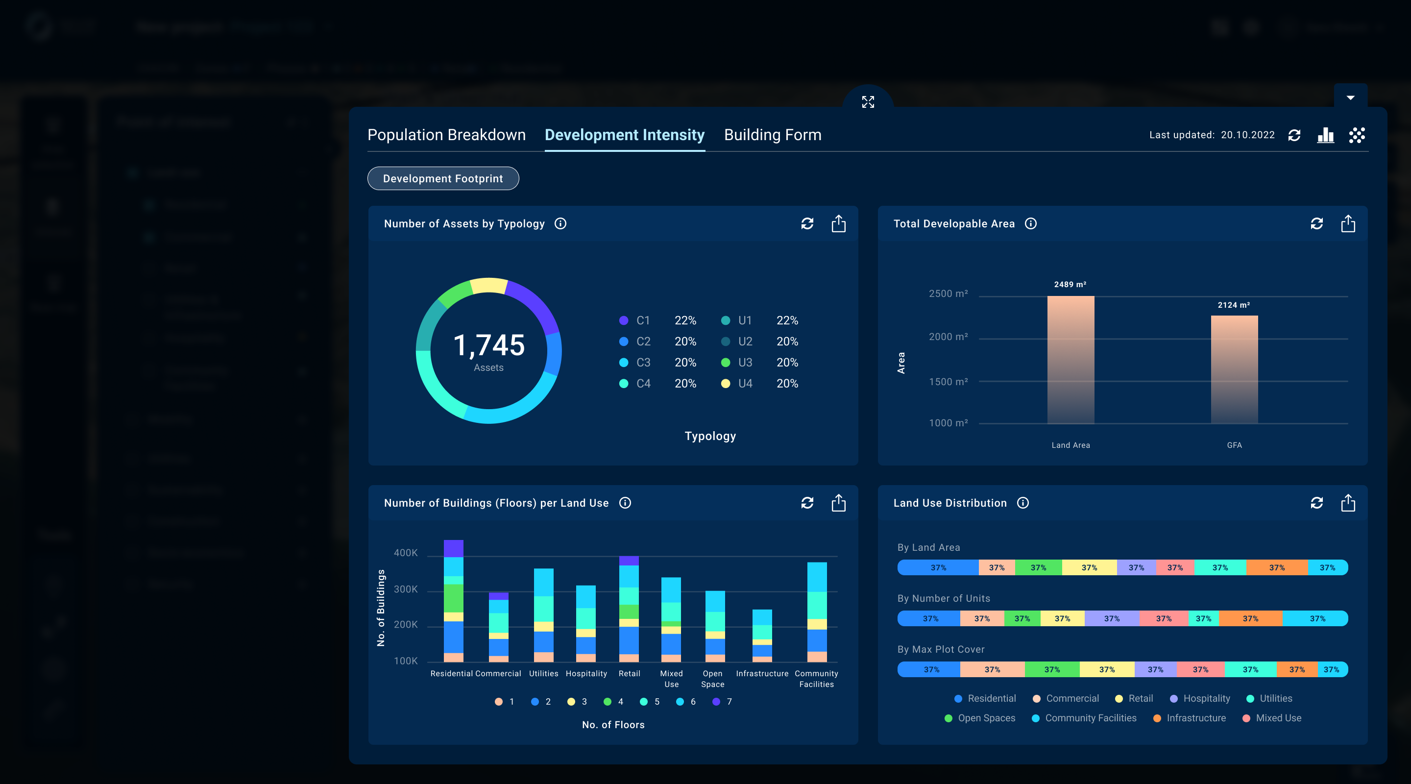
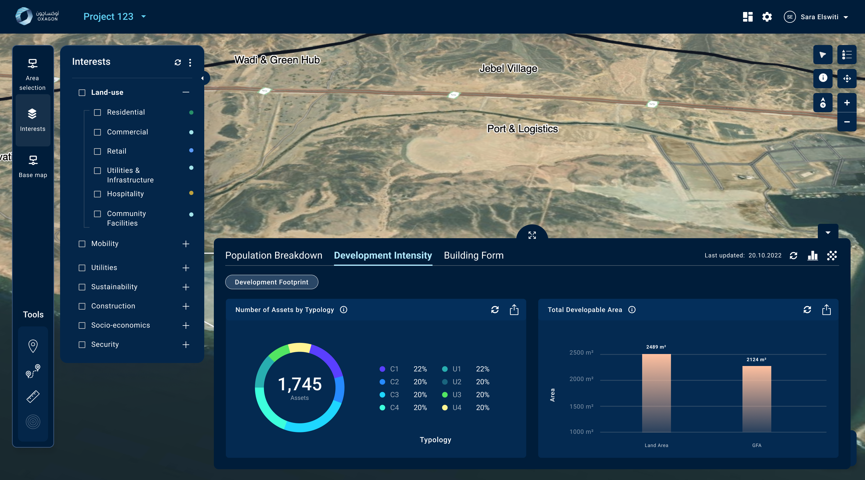
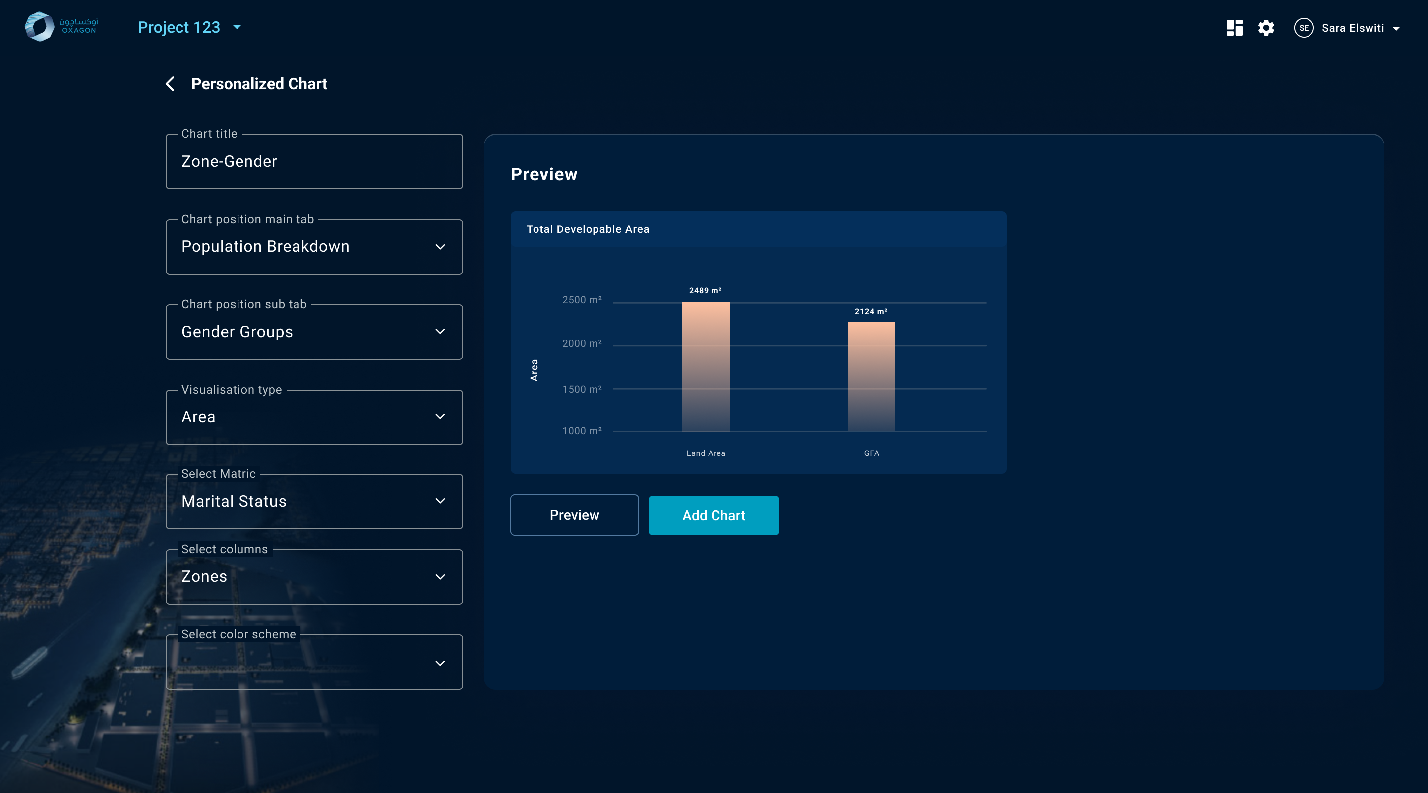
Selecting an area opens floating dashboards that sit over the twin without swallowing it — Population Breakdown, Development Intensity, Building Form. Every panel reads from the same model, so numbers, map and 3D never disagree. And because no dashboard predicts every question, users can compose their own charts from the underlying data.

Development Intensity dashboard over the twin
Assets by typology and developable area
Personalised chart builder
Floating analytics · development-intensity breakdowns · a build-your-own chart tool for questions the defaults don't cover.06–08 / 09
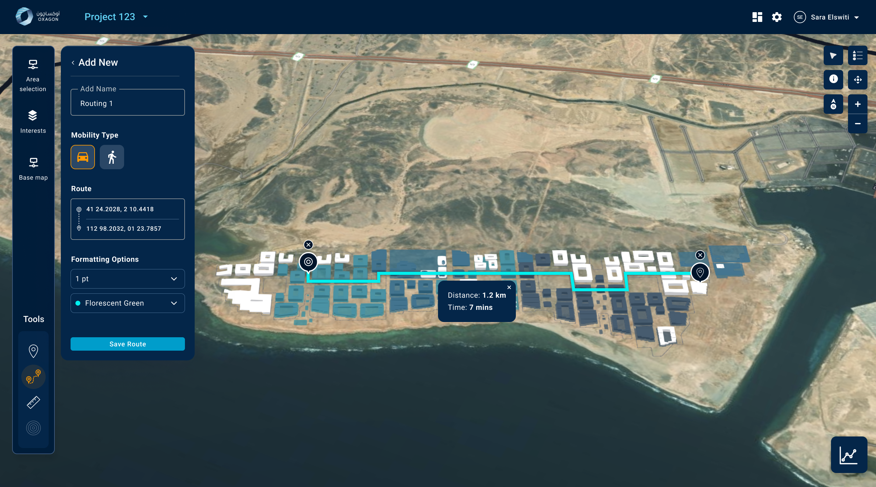
Routing tool measuring distance and time across the twin
Tools layer — routing, measurement and catchment, answering mobility questions directly on the model.09 / 09

08 Outcomes & Impact

A masterplan you can interrogate — not just present.

The twin gave planning, investment and leadership a single place to reason about Oxagon, and gave the wider programme a design language that kept every new module consistent as the platform grew.

<0min
To a first meaningful query
from a cold start
0
Stakeholder modes on one twin
Discover · Simulate · Manage
0
Interest layers unified
GIS + BIM + socio-economic
0
Governed design language
light + dark, tokenised
Figures are illustrative — reconstructed to frame the impact of the work, not audited programme metrics.

“For the first time the masterplan stopped being a document and became something we could question — the same model in the room for investors, planners and operators.”

— Programme stakeholder, Oxagon Digital Twin (illustrative)
If I ran it back

I'd pressure-test the data-viz palette under the live sun-simulation even earlier — colour that survives changing light is a foundation decision, not a finishing one.

Next project
Aldar Sales Portal