Overview Goals Process Research Persona Decisions Visual Design Outcomes
Case Study  ·  Real Estate  ·  Tablet Platform

Aldar Sales Portal

Reimagining how sales agents at a leading Middle-East developer discover, offer and close property — on a single tablet platform.

Lead DesignerDesign WorkshopUX DesignVisual DesignProject Management
Role

Lead Designer

Team

Team of 2

Duration

20–24 weeks

Platform

Tablet (iPad)

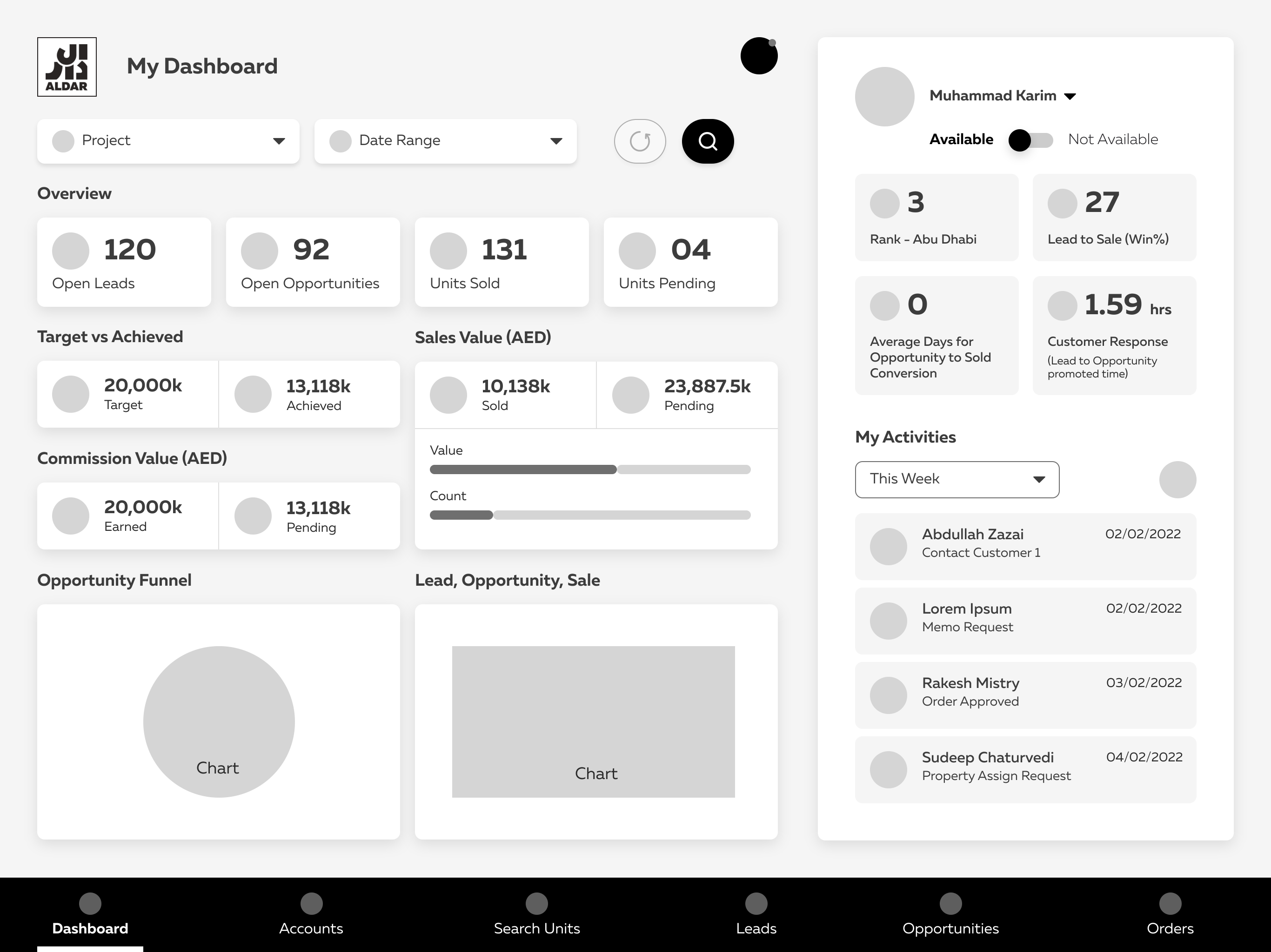
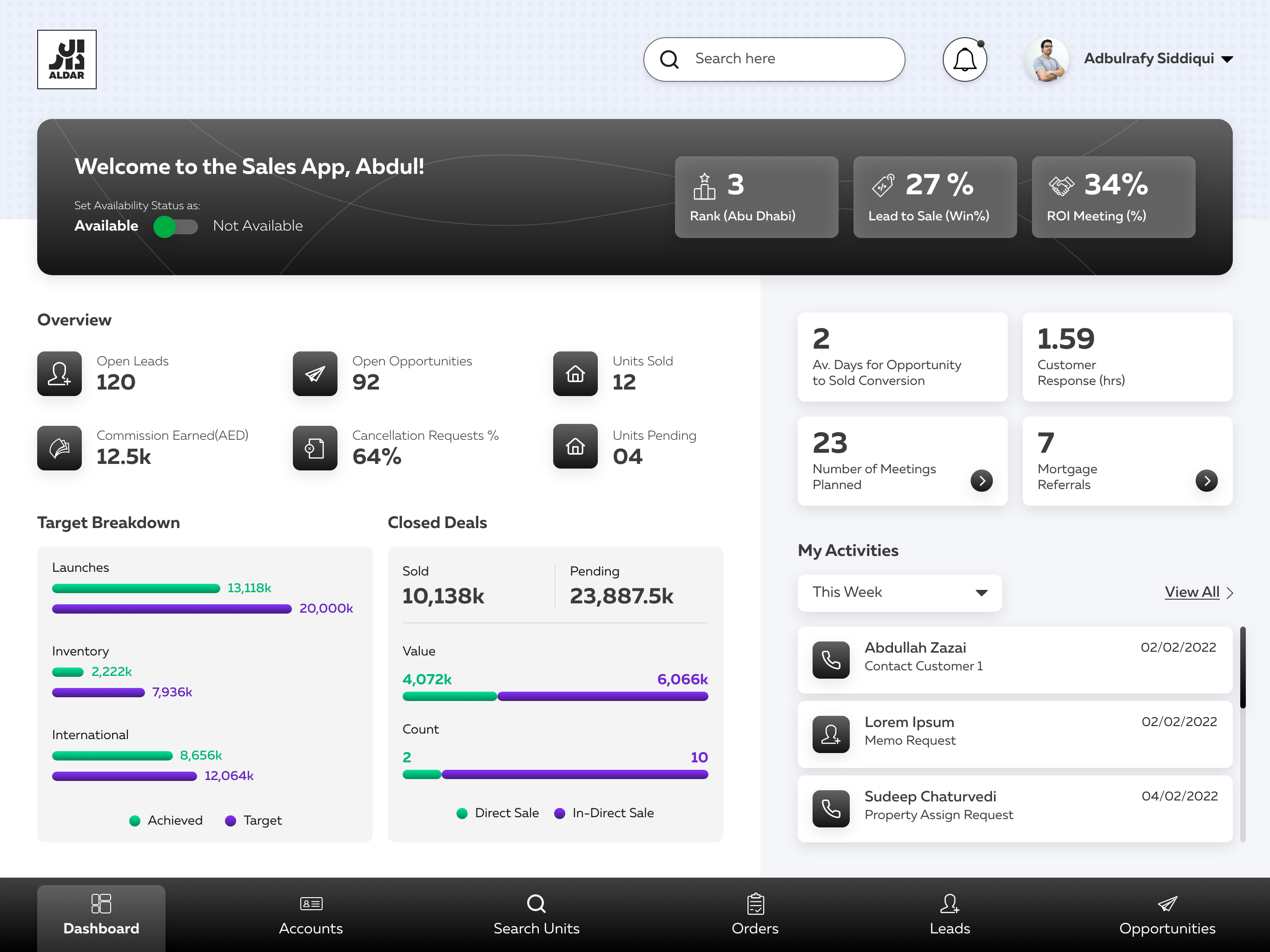
Sales Portal — Dashboard (final UI)
Image placeholder

01 Overview & Problem

Agents were closing million-dirham deals on a portal built for a desk.

Picture a sales executive standing in a show-home with a serious buyer. To pull up a sea-view 2-bed, generate an offer and reserve it, they had to say “let me send that over later” — then drive back to a desk and wrestle a slow, desktop-bound portal. Momentum lost, hot leads cooled.

This was the reality at a leading Middle-East developer. Leadership's brief: make it genuinely easier for agents to browse inventory, generate offers and close units — right in front of the client, on a tablet.

0%
Of an agent's day on manual admin
0
Steps to book a single unit
0
Disconnected tools per deal
0%
Lead-to-sale win rate (baseline)

02 Goals & Success Metrics

What “good” looked like — agreed with the business up front.

We translated leadership's ambition into three measurable goals, using the portal's own performance KPIs as the yardstick so success wasn't a matter of taste.

01

Let agents close in front of the client

Target — booking flow 12 → under 6 steps
02

Turn more qualified leads into sales

Target — lead-to-sale win rate 27% → 35%+
03

Reduce post-sale cancellations

Target — cancellation requests down 20%

03 Process

A step-by-step journey from understanding the old portal to a signed-off UI direction.

Step 01

Understand the current portal

Mapped how the existing sales portal worked and captured every flow directly from the client.

Step 02

Prep & run a workshop

Digested the findings and ran a workshop to learn what worked and where the real scope for improvement was.

Step 03

Co-create personas & journeys

Showcased the primary personas and their customer journeys, then finalised the feature list together.

Step 04

Wireframe & direction

Crafted wireframes plus visual options for key screens to get the client to approve the final UI direction.

04 Heuristic Analysis

First, we pulled the current dashboard apart.

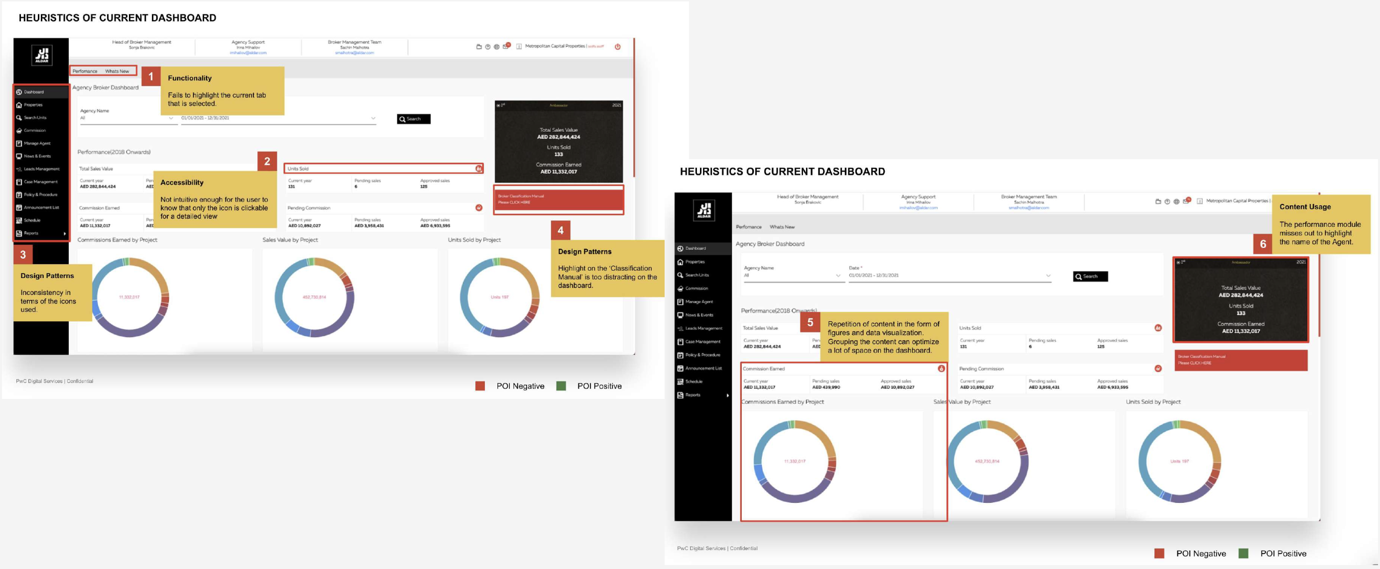
A heuristic evaluation of the existing broker dashboard surfaced six recurring problems — the friction agents were quietly working around every day.

Annotated heuristics — current dashboard
Image placeholder
01

Functionality

The selected tab was never highlighted — users couldn't tell where they were.

02

Accessibility

Not intuitive: only an icon hinted at a detailed view, with no affordance that it was clickable.

03

Design patterns

Inconsistent iconography and weights made the interface feel unresolved.

04

Distraction

The 'Classification Manual' block dominated the dashboard for no real reason.

05

Repetition

Figures and charts repeated the same content — grouping could reclaim a lot of space.

06

Content usage

The performance module missed obvious context, like the agent's own name.

05 Competitive Analysis

Then we studied what the market already got right — and wrong.

DAMAC Portal
+Conversational UI guides the user to the desired action with ease.
All emphasis on one function — not always the user's end goal.
Dubai Properties Dashboard
+Minimal, data-focused layout with strong contrast and emphasis.
Sub-optimal use of space; no indication of the selected tab.
Emaar Landing
+Well-structured content with a clear visual hierarchy.
Low contrast over imagery; inconsistent icon and type weights.

06 Persona & Journey

Everything centred on one person: the sales executive.

A

Abdallah

Sales Executive

“I want to hit my personal target by the end of Q3.”

Knowledge
Confidence
Recognition
Needs
  • Find available properties & details in a few clicks
  • View all leads and interact with them easily
  • Track the status of every opportunity he owns
Frustrations
  • Can't track the status of various properties
  • No quick view of his biggest clients
  • Too much time on low-value, manual admin
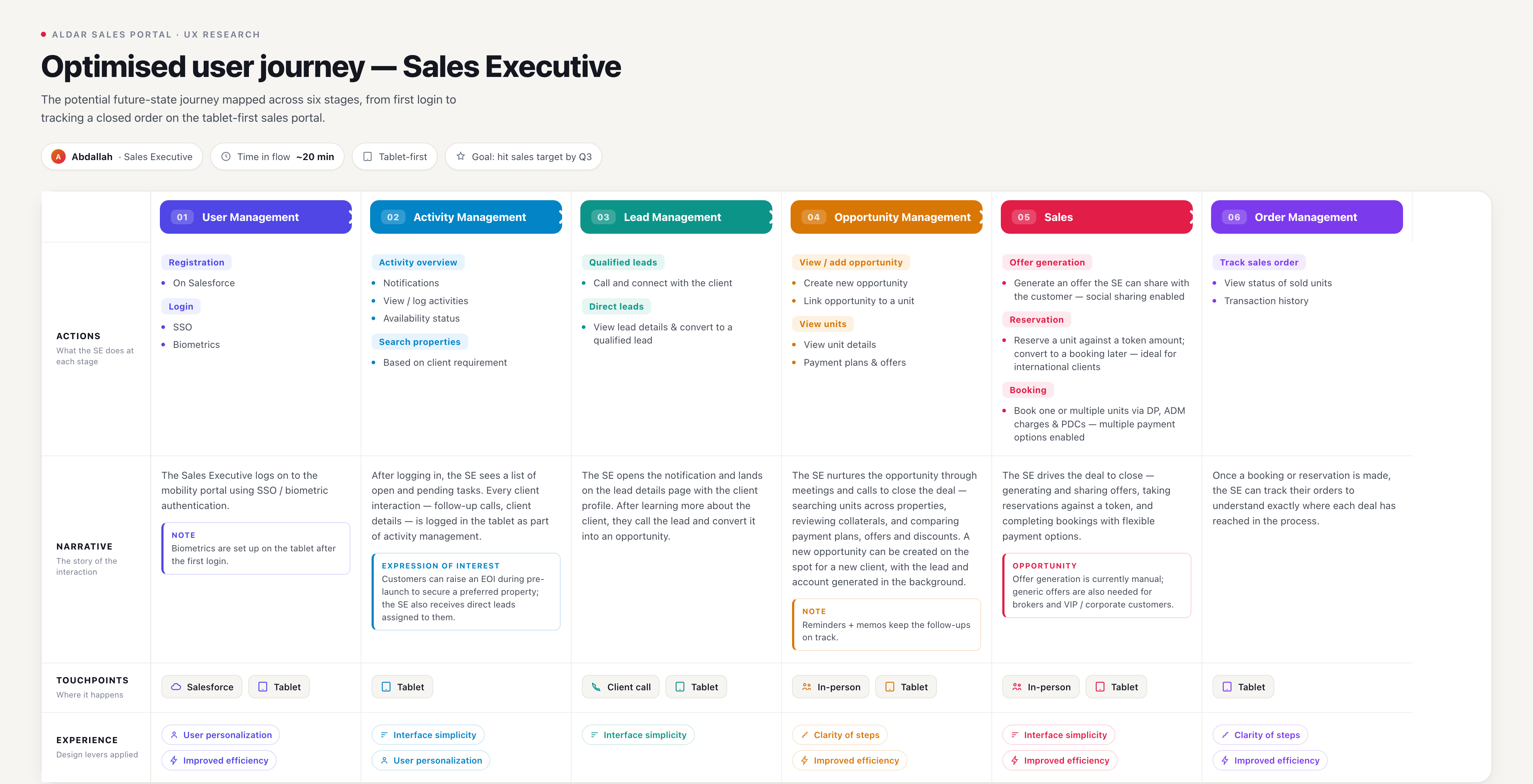
User journey — sales executive, end to enddetail below
Future-state user journey map
Image placeholder

07 Feature Prioritisation

A long laundry list, prioritised into a confident phase-one scope.

I built out every feature the platform could hold, ran a discovery playback with stakeholders, then mapped each idea onto a value vs. effort matrix to agree what shipped first.

Effort → Value → Highest priority Yes Why not Later Search Properties Availability Status View Payment Plans & Offers View / Generate Offers Create New Opportunity Budget Check Notifications View Activities Share Offer Request to Assign Expression of Interest
Outcome of prioritisation Phase 1 shipped: Search Properties, Availability Status, View Payment Plans & Offers, View / Generate Offers, and a guided Create-Opportunity & booking flow. Deferred: Request to Assign and Expression of Interest — real value, but not worth blocking launch for.

08 Architecture & Wireframes

From feature list, to information architecture, to low-fi flows.

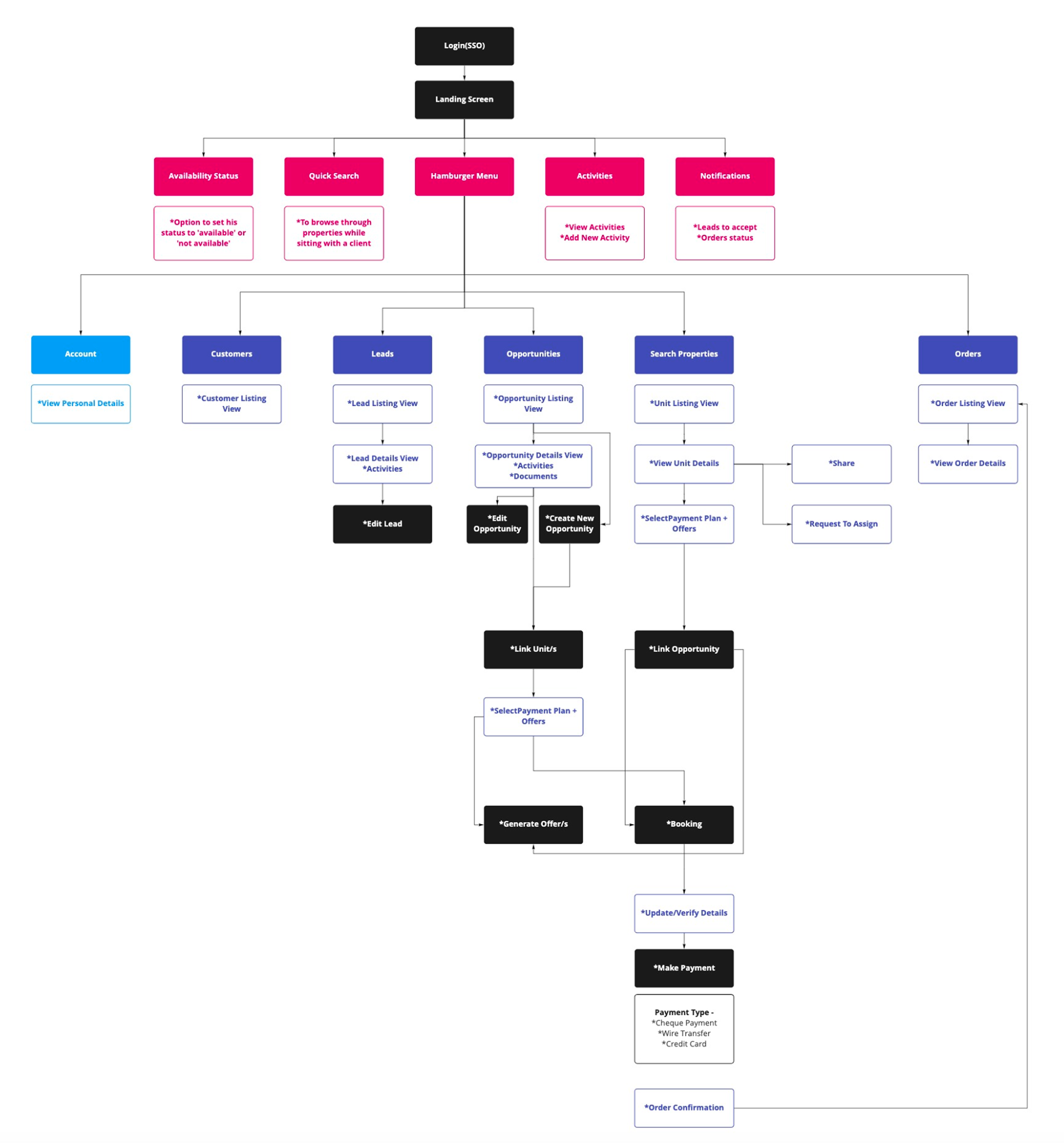
With the scope signed off, I built the information architecture and key user flows, then translated them into low-fidelity wireframes for the primary tasks.

Information architecture
Placeholder
Primary user flow
Placeholder
Low-fidelity wireframes — key screens
Placeholder

09 Key Decisions

Four decisions that shaped the product — and what we traded off.

Research only matters when it forces a call. These were the moments insight turned into a decision, each with a real cost attached.

01

Tablet-first, built for standing up

InsightAgents close in show-homes, not at desks — yet every tool assumed a keyboard and mouse.
DecisionA one-thumb booking flow and a persistent unit “cart”, designed tablet-first for use mid-conversation.
02

Scan, don't type

InsightManual KYC entry was the single biggest time-sink and the top source of bad records.
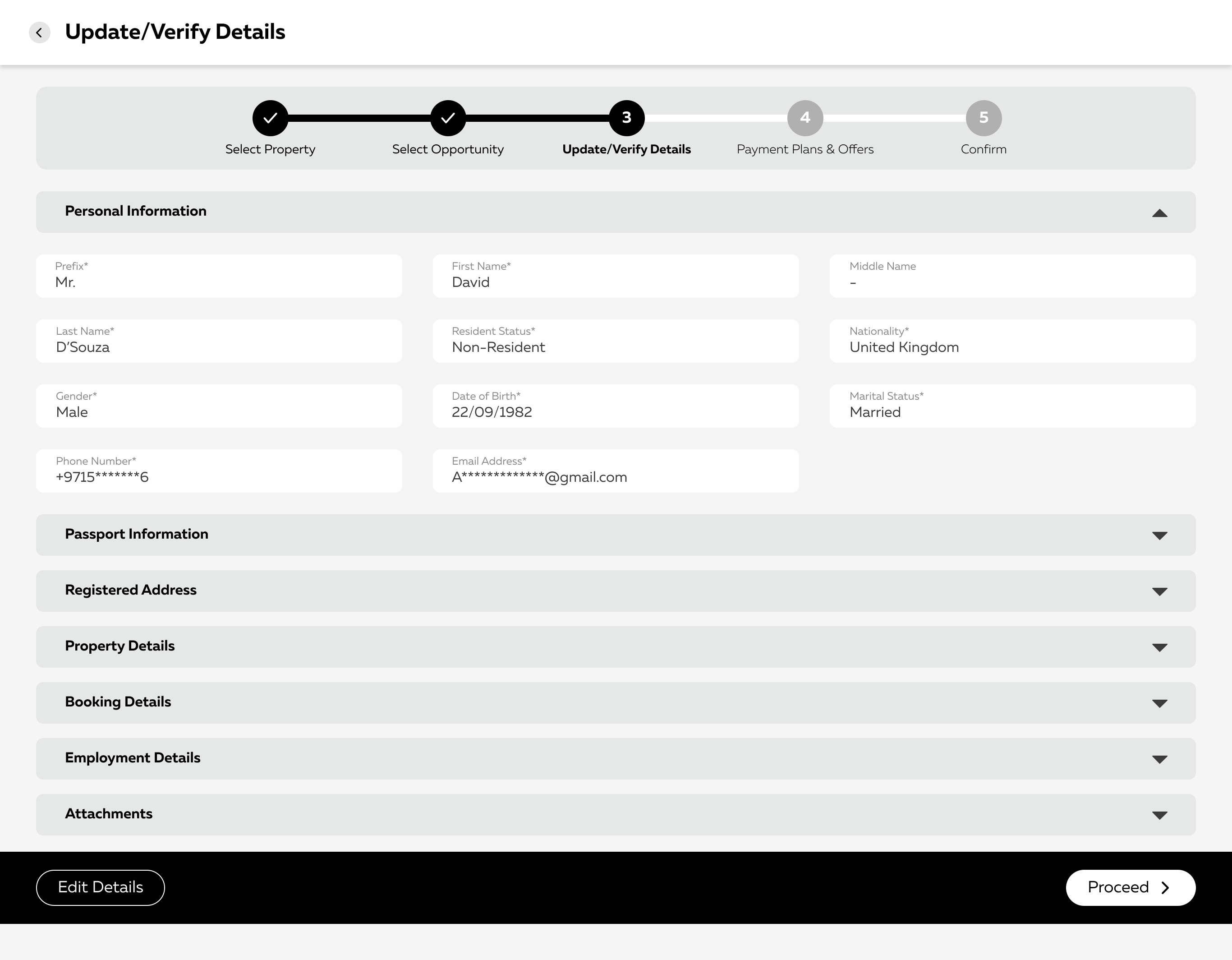
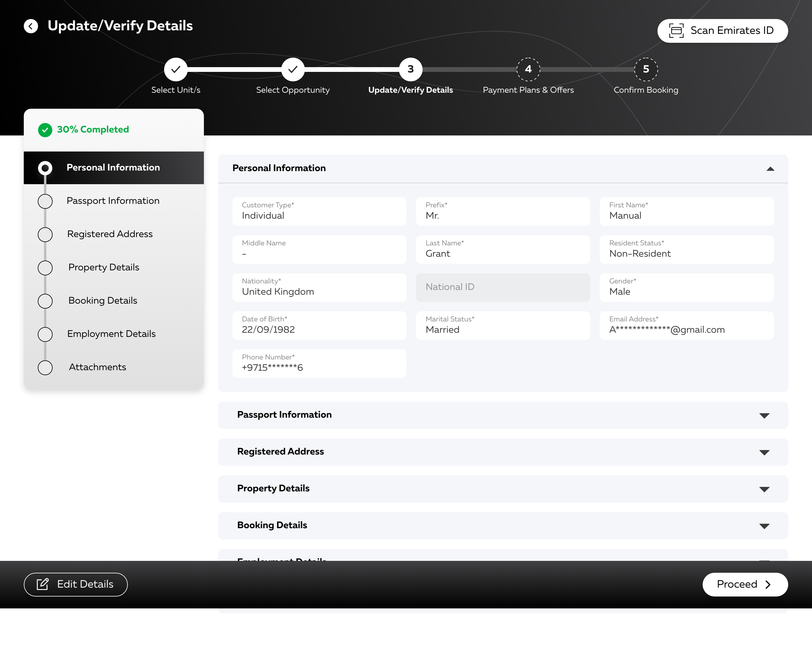
DecisionOCR-assisted onboarding — scan an Emirates ID or passport to auto-populate customer details.
Trade-offAdded a dependency on OCR accuracy, so we designed a clear manual-correct fallback for edge cases.
03

A guided booking wizard, not a free-form form

InsightFree-form entry let agents skip fields and create records that broke downstream.
DecisionA validated stepper — Unit → Opportunity → Verify → Payment plan → Confirm — with inline checks.
Trade-offMore screens per booking, accepted in exchange for far fewer errors and less rework.
04

Live availability, always

InsightAgents were pitching units that had already been reserved — an avoidable, credibility-costing moment.
DecisionReal-time inventory with an availability toggle surfaced on every unit.
Trade-offLeaned on backend sync latency, so we designed an honest “pending” state rather than faking certainty.
10 Visual Design

A focused, high-contrast interface built around one job: close the deal, fast.

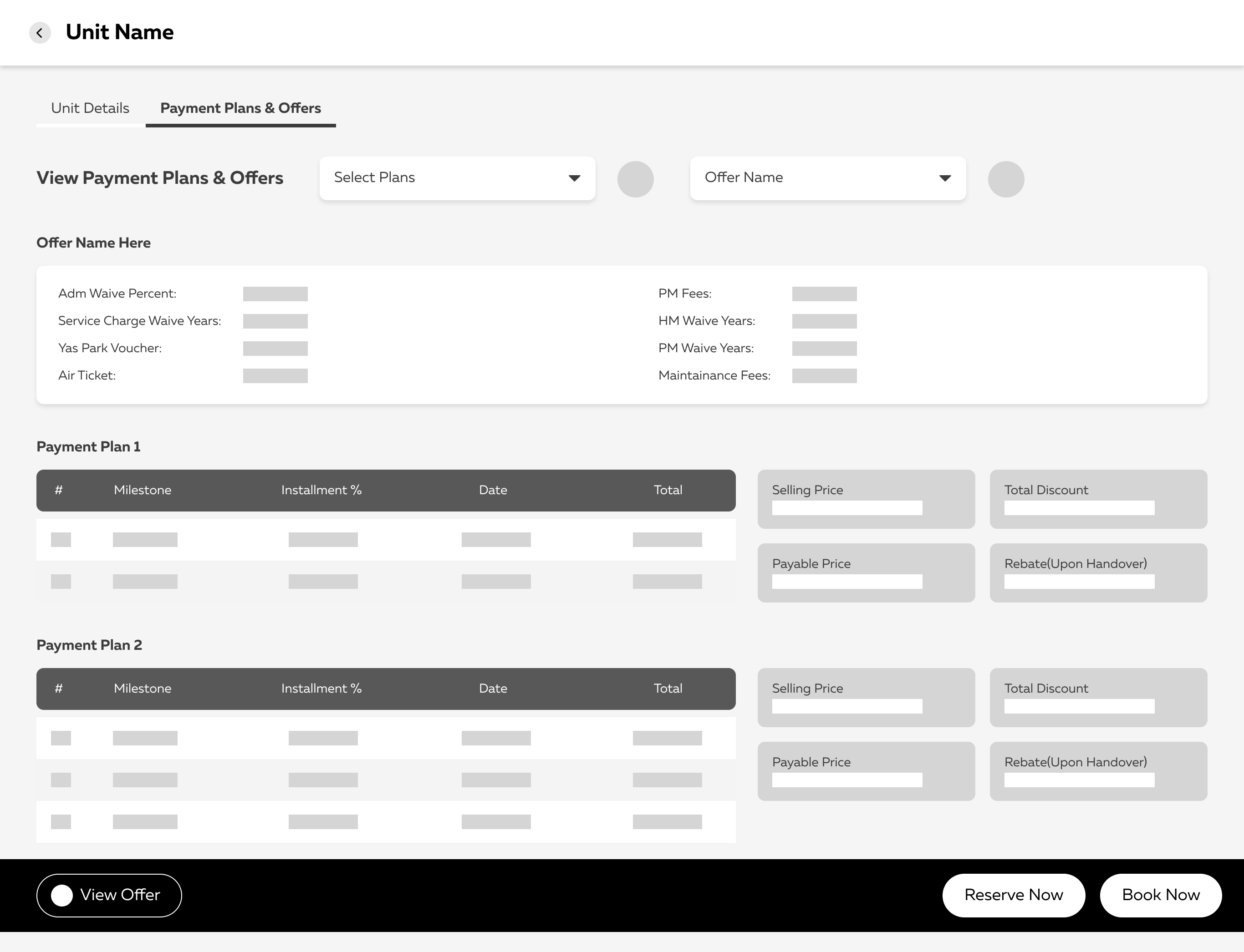
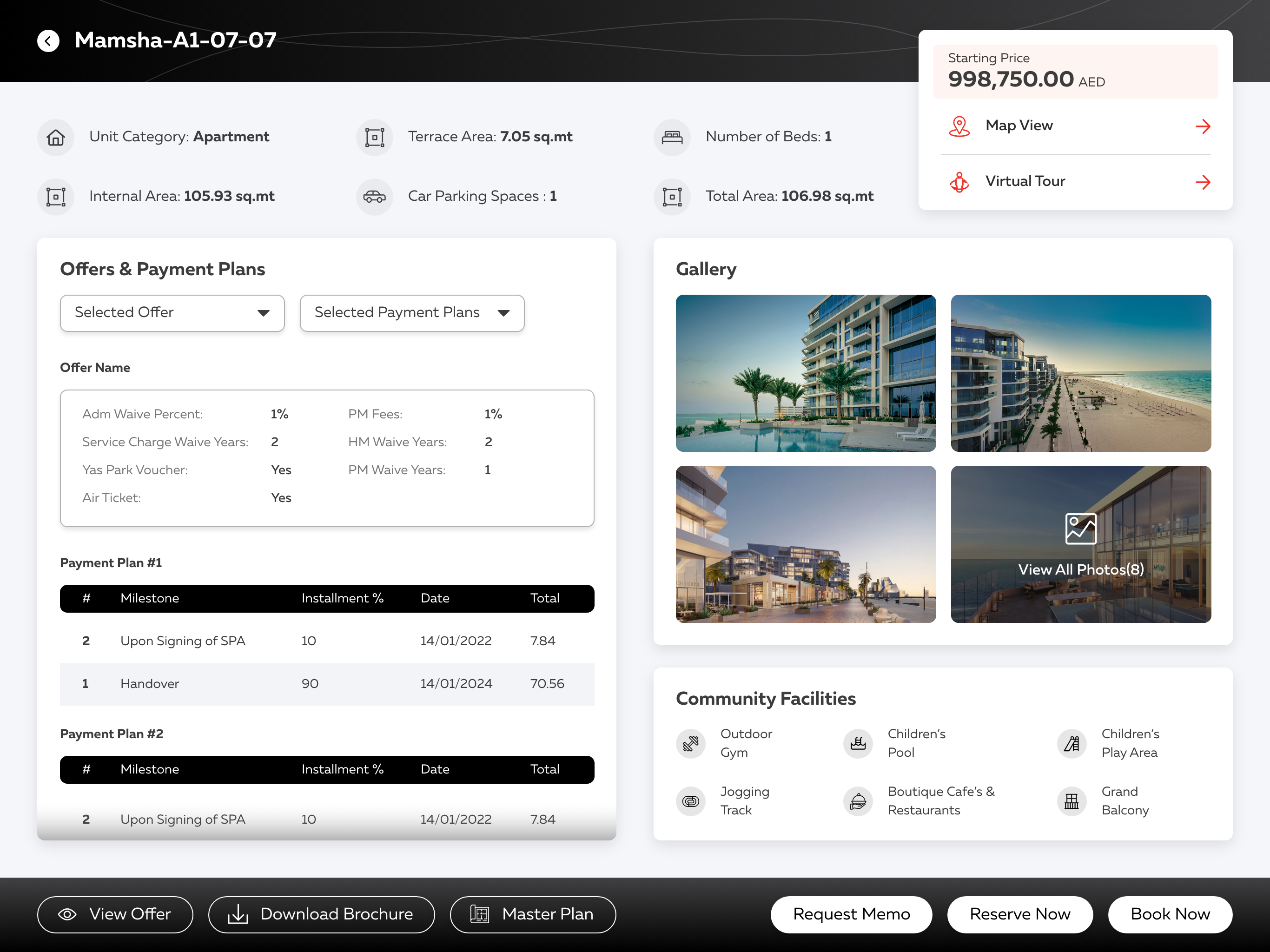
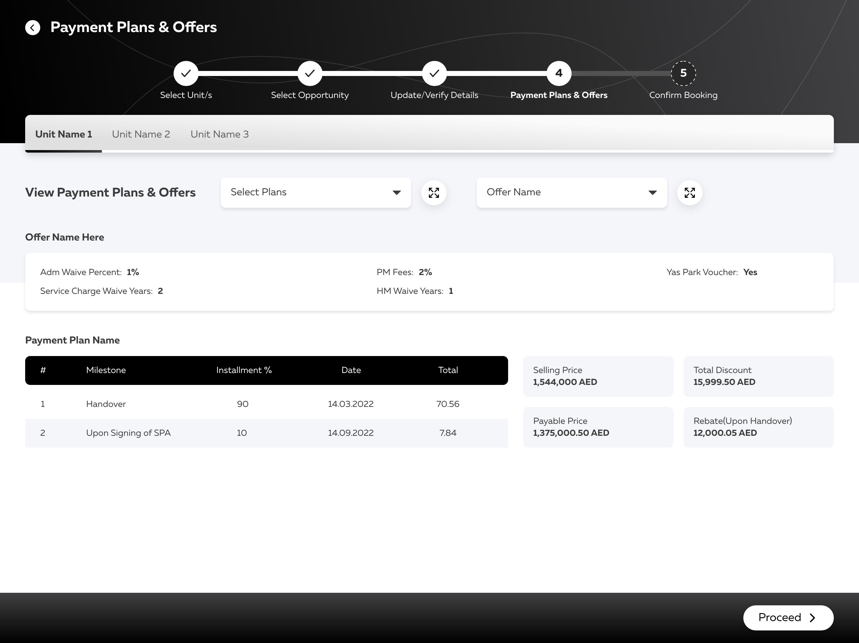
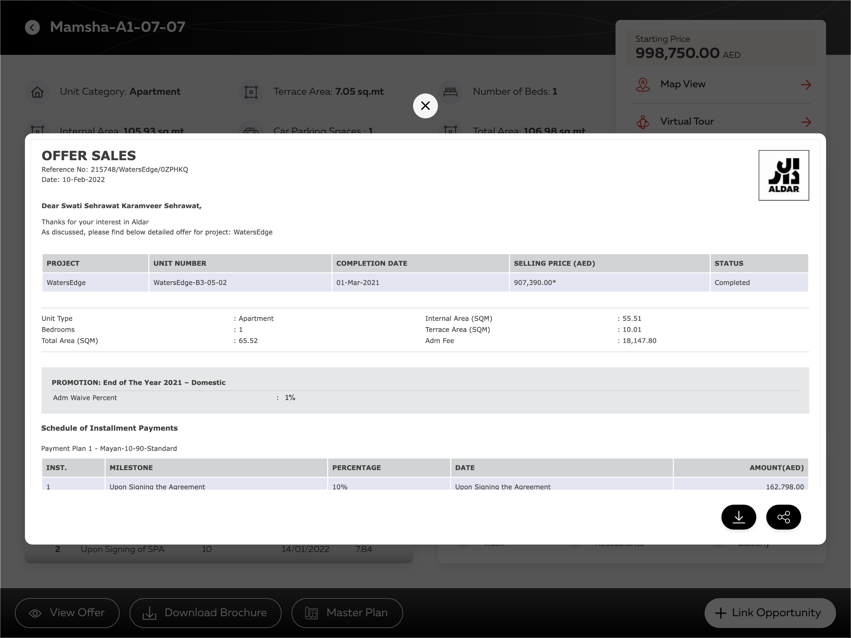
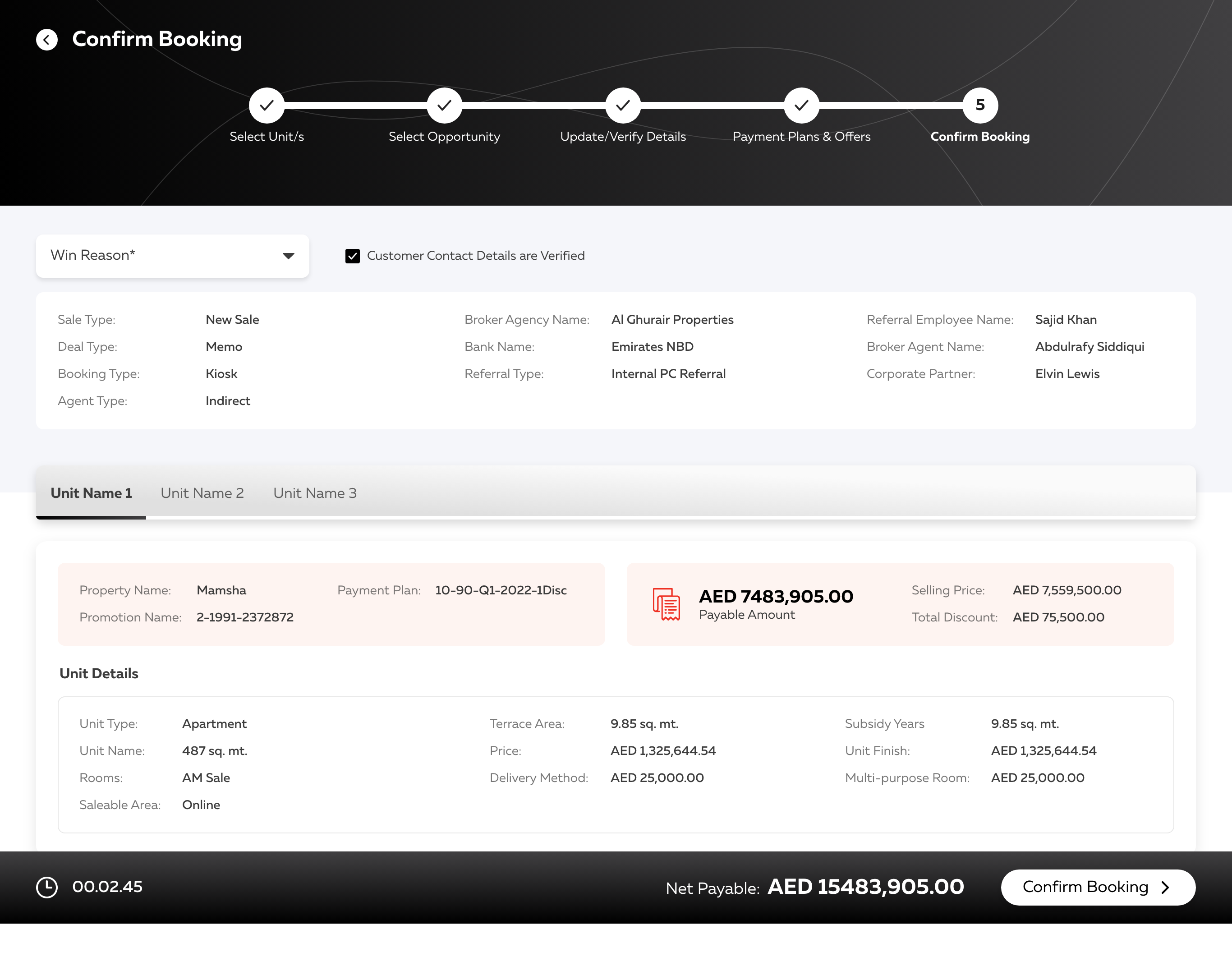
The visual language put booking and reservation front and centre — because agents are always on the move, closing deals in front of clients rather than behind a desk.

Dashboard — final visual design
Placeholder
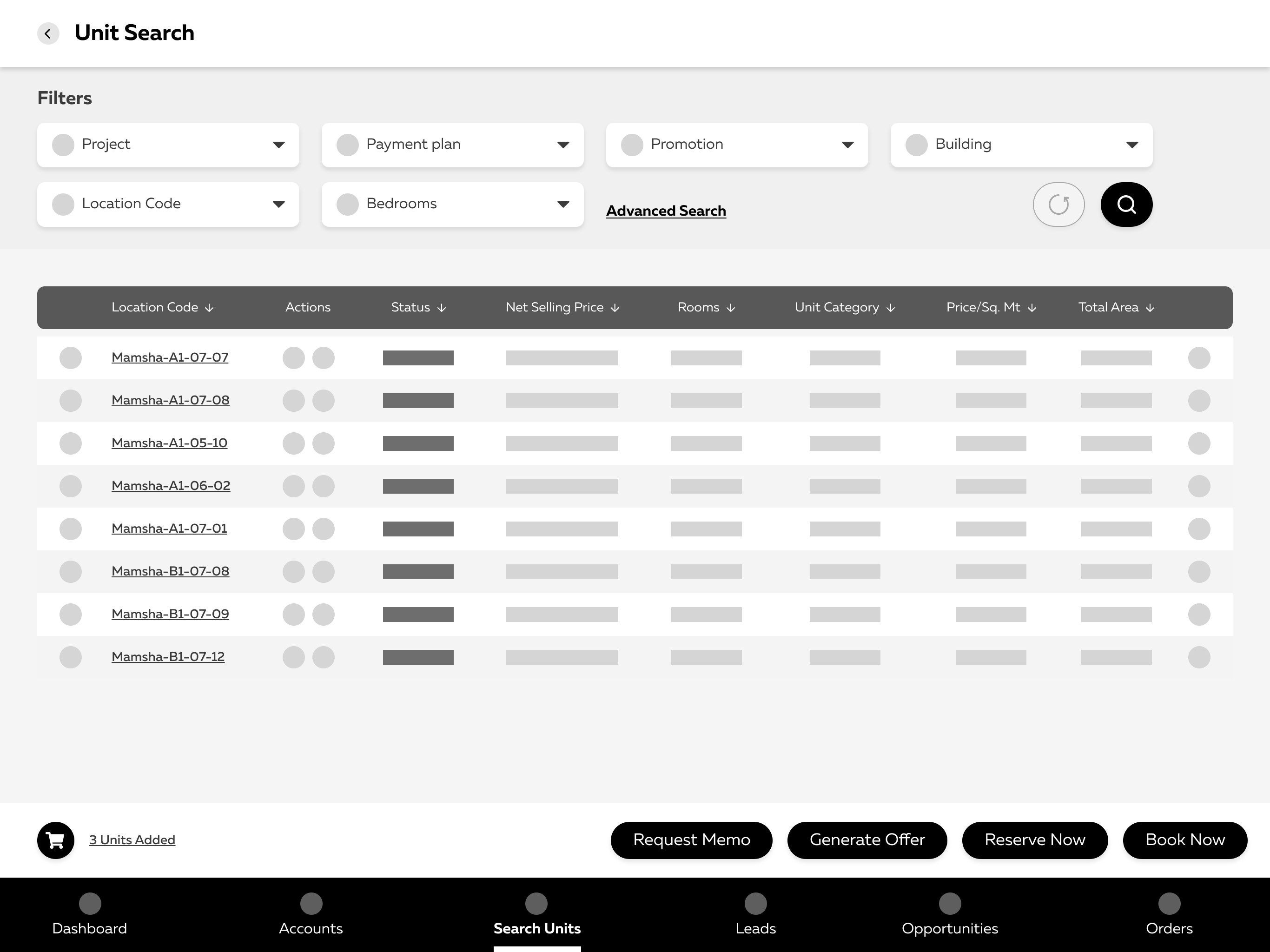
Property search & filters
Placeholder
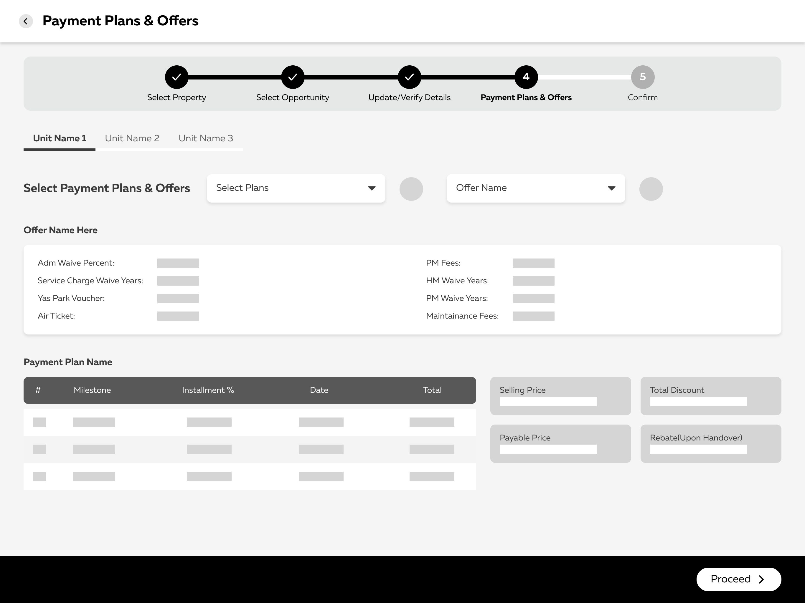
Payment plans & offers
Placeholder
Update / verify details (OCR)
Placeholder
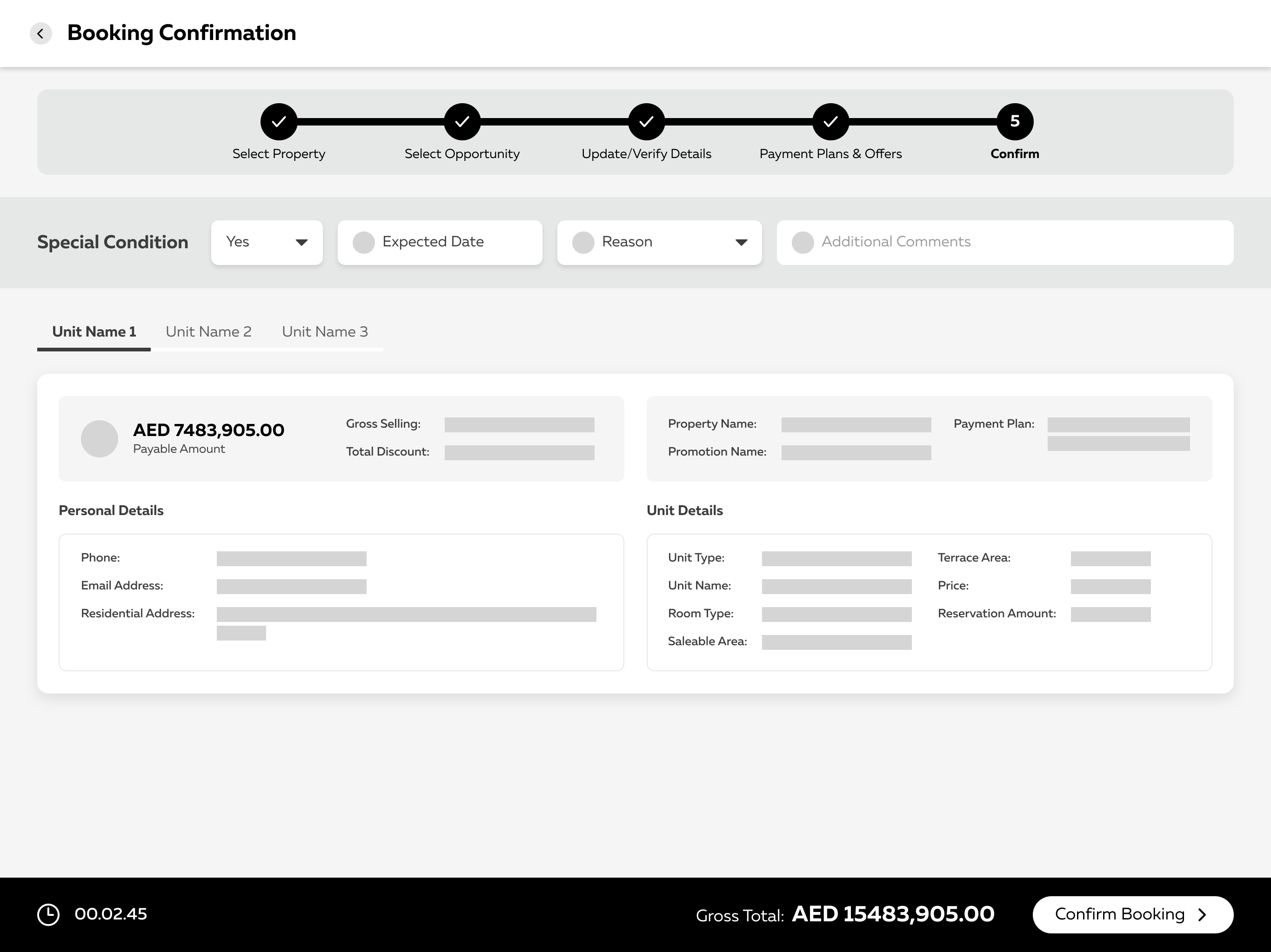
Confirm booking
Placeholder

11 Outcomes & Impact

Piloted with agents in Abu Dhabi — and the numbers moved.

The redesign rolled out to a pilot cohort of sales agents before wider release. Early results tracked directly against the three goals we set at the start.

0
Steps to book a unit
down from 12
0%
Faster to first offer
generate & send in-room
0%
Lead-to-sale win rate
up from 27% in pilot
0
System Usability Scale
“excellent” · grade A

“For the first time our agents are closing on the tablet in the room, instead of promising to follow up. That alone changed the pace of the sales floor.”

— Head of Sales Enablement, client side
If I ran it back

I'd get a clickable prototype in front of real agents by week 3, not week 12 — watching them fumble the booking flow taught us more in an afternoon than the workshops did in a month.

Next project
SRMG Design System